Music Streaming App Concept

From idea to concept in 24hrs.
I believe the problem with most music apps is their UX/UI is a bit outdated. It doesn't help that at big companies it can take longer to implement new design decisions.
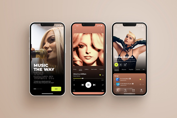
One of the biggest changes was utilizing slider tabs so that users can select exactly what they are looking for then scroll down to display the information they want to see.
I added a quote from the artist so that users can feel more closer to the artist and simply to hear what they're favorite artist has to say.
Directly below the artist you'll have the option to play, shuffle play, and follow.
The color of the card with the songs will change according to the artists' pallette and I added this because I believe it helps break up some of the information.
Everything else is pretty typical...but a bit cleaner in my opinion haha.
For projects or collaborations:
Thanks for your time.