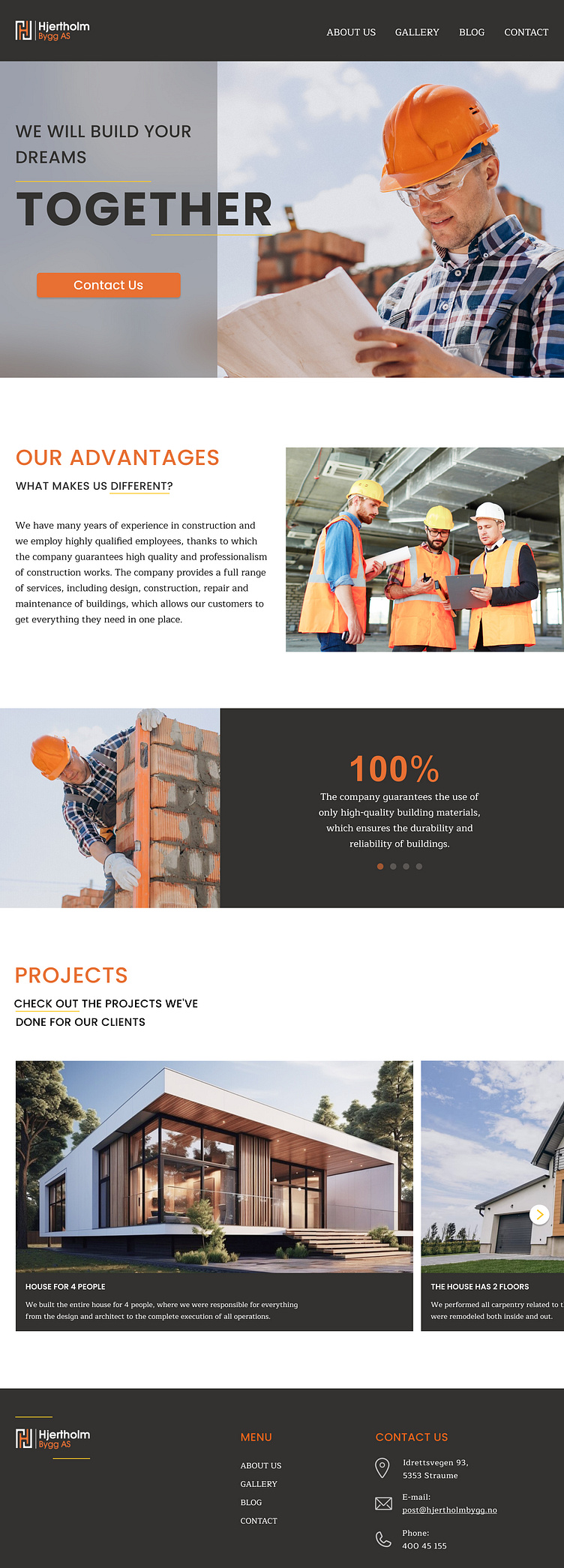
Home page for a construction company
The task was to create a home page for a construction company that already had a web page but an outdated design. The customer's condition was the use of key colors, namely a shade of black, a shade of orange, because these colors are included in the company's logo, and a shade of yellow, because the client liked the site that used this color. Also, the client's wish was to create four sections in the menu, in the future a separate page should be developed for each section. The home page should also have a call-to-action button to attract new potential customers.
More by Irina Prokopovych View profile
Like
