HealthTap: Branding
The Client
Healthtap develops and applies cutting edge AI technologies to problems in skilled nursing facility administrations and resident care.
The Challenge
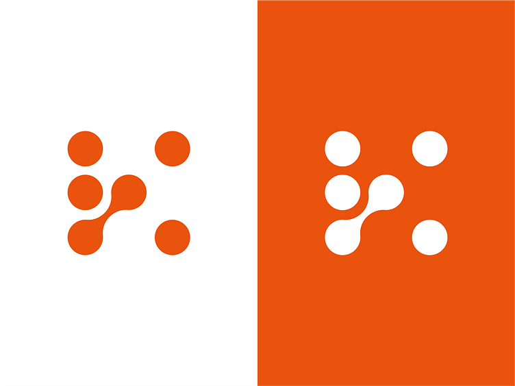
With their logo chosen, Healthtap’s team wanted us to consider industry relevance and vibrancy in their color palette. they wanted their colors to not only catch user’s attention, but also generate a sense of warmth in their users.
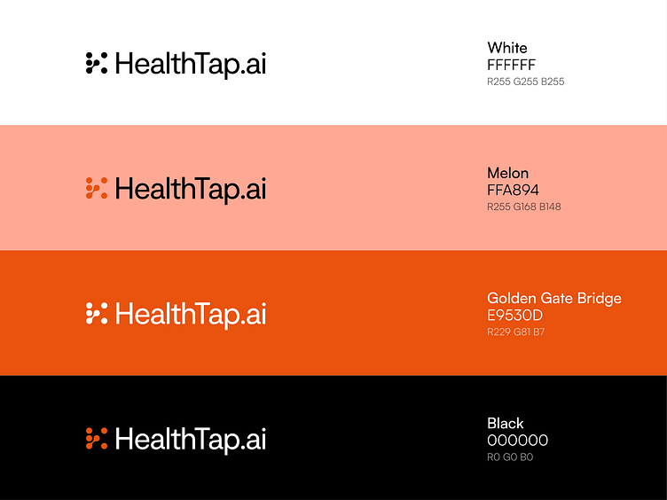
The Solution
In order to combine industry relevance and a sense of warmth, we went with a primarily orange color palette. Using Golden Gate Bridge orange as their primary color, the vibrancy really fosters a sense of safety to viewers. The color choice of the secondary colors reflects a positive emotional connection, making HealthTap's interface both visually appealing and conducive to a reassuring healthcare journey.
We are thankful that Healthtap worked in collaboration with us to not only choose their new logo, but create the rest of their branding as well!
Who is Caviar?
Caviar is a design agency dedicated to helping clients bring their visions to life. We specialize in a variety of design skills including, but not limited to: UI, Web Design, Mobile Design, Illustrations, and Product Design. Our motto is “Building brands, websites and experiences” we take pride in making sure that Caviar is an agency that not only gives high-quality designs but high-quality experiences.
Check us out at https://eatcaviar.co
