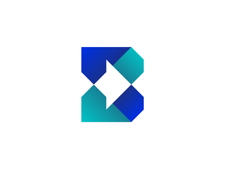
XDB Architecture Studio Logo Design
This one is a modern 'triogram' or how should I call a shape made of 3 letters? ☘3️⃣③ Haha. It was a proposal made for an architecture studio and it subtly contains the X D B letters.
The concept was just inspired by the letters, I didn't necessarily want to expose them. But the sketching process led me to this new shape that speaks for a certain architectural process - straight lines, precise angles (90, 45, 0).
At the same time, the shape somehow holds a right-oriented arrow, which I think could be used more in the brand identity - for brand patterns or for certain applications - like a mug holder or something.
Of course, to create a more modern look & feel, I split it in two parts and colored them with minimal gradients.
Give it a like if you feel like it! Thanks! 🙏
