[2024] 002: Fusion
Fusion is a concept web application similar to Microsoft Teams, the BAND app, or Google Classroom. It allows teams, classrooms, or groups of any kind to connect seamlessly and accomplish tasks with file sharing, chat, timelines, group pages, and other tools.
Since this is a branding project, let's get on with the logo design!
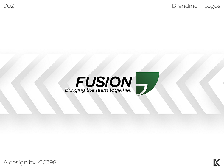
The Fusion logo is composed of quarter-circles, and can be identified in two parts:
- - -
The primary (larger) quarter-circle. A smaller quarter-circle is carved into its side, making it an abstract form of a chat bubble.
The secondary (smaller) quarter-circle. Since we are speaking in context of the chat bubble, it can act as either the content inside of the chat bubble or the user who sent the chat bubble.
The Fusion wordmark is composed of two parts as well:
- - -
The brand name, which is written with a modified version of Red Hat Display. The "I" appears as it is splitting in half, however if we look at it backwards, it can look like the split parts of the "I" are coming together. This reflects on Fusion's tagline.
The tagline, which is written with the official italicized version of Red Hat Display. It reads, "Bringing the team together," which really reflects the features in Fusion.


