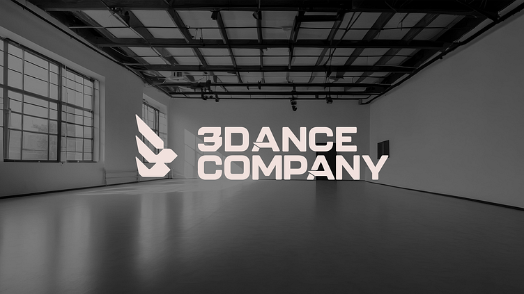
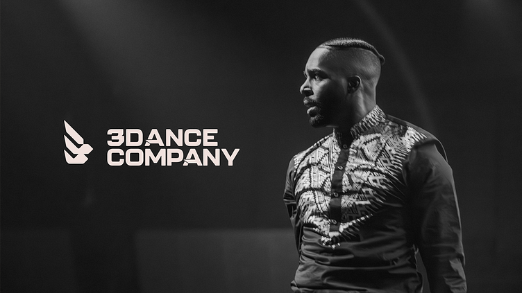
3 Dance Company Brand Design

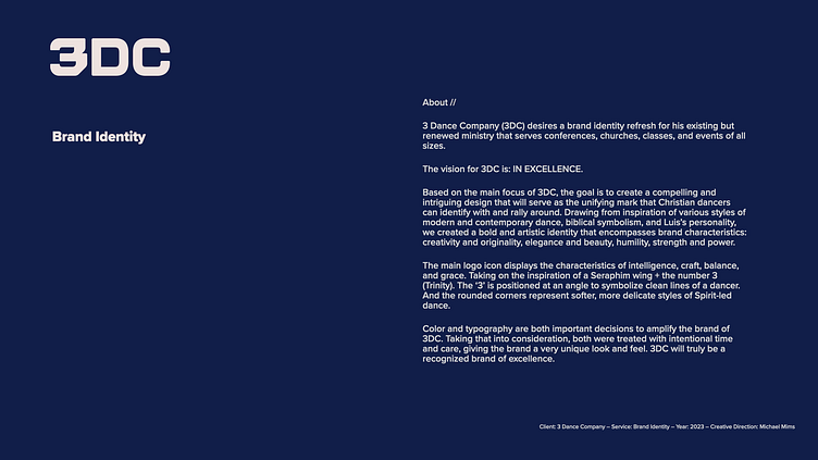


About //
3 Dance Company (3DC) desires a brand identity refresh for his existing but renewed ministry that serves conferences, churches, classes, and events of all sizes.
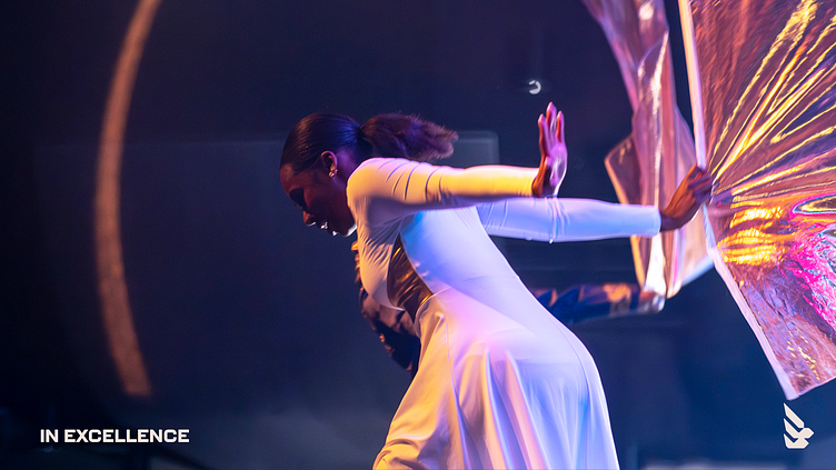
The vision for 3DC is: IN EXCELLENCE.
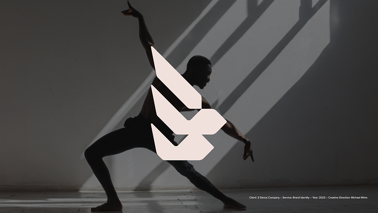
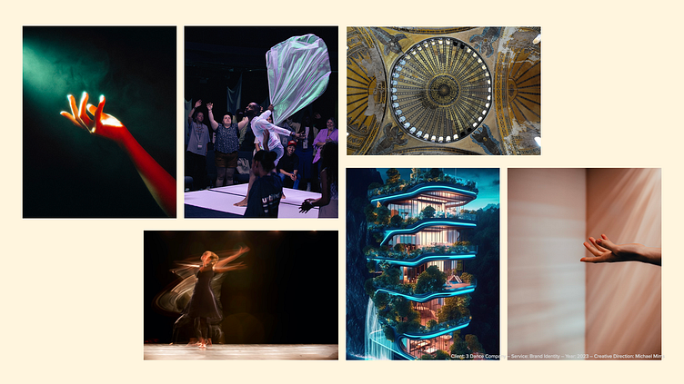
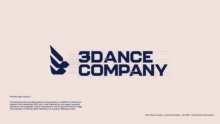
Based on the main focus of 3DC, the goal is to create a compelling and intriguing design that will serve as the unifying mark that Christian dancers can identify with and rally around. Drawing from inspiration of various styles of modern and contemporary dance, biblical symbolism, and Luis’s personality, we created a bold and artistic identity that encompasses brand characteristics: creativity and originality, elegance and beauty, humility, strength and power.
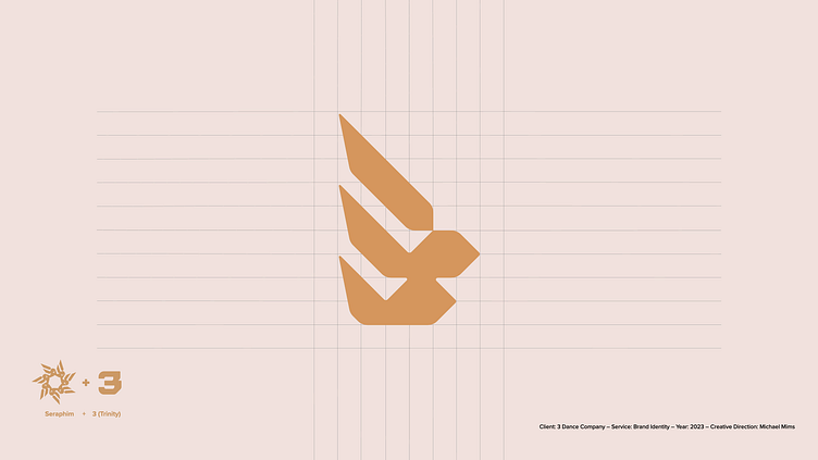
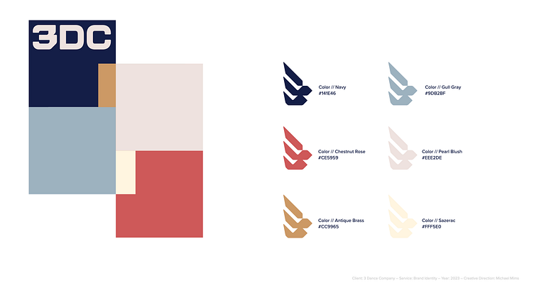
The main logo icon displays the characteristics of intelligence, craft, balance, and grace. Taking on the inspiration of a Seraphim wing + the number 3 (Trinity). The ‘3’ is positioned at an angle to symbolize clean lines of a dancer. And the rounded corners represent softer, more delicate styles of Spirit-led dance.
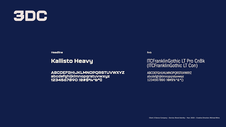
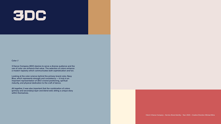
Color and typography are both important decisions to amplify the brand of 3DC. Taking that into consideration, both were treated with intentional time and care, giving the brand a very unique look and feel. 3DC will truly be a recognized brand of excellence.