DigitancerTech Brand Identity
DigitancerTech Brand Identity
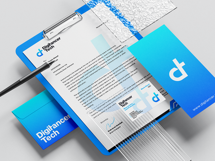
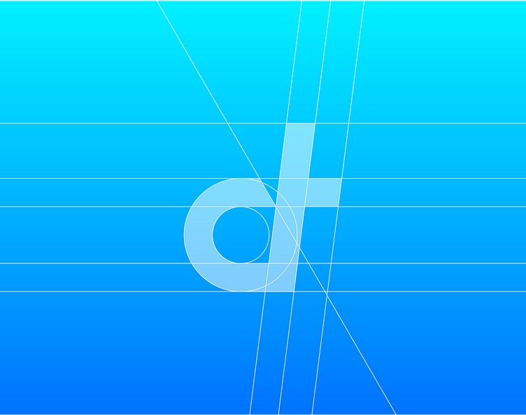
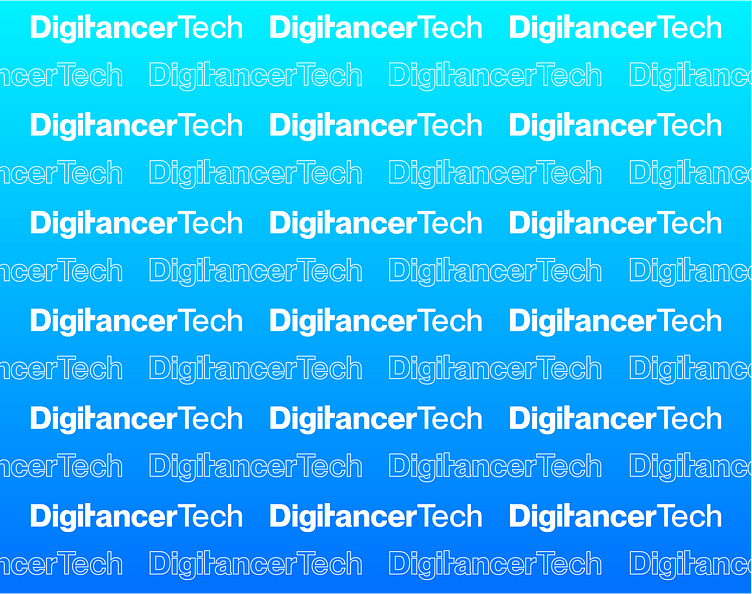
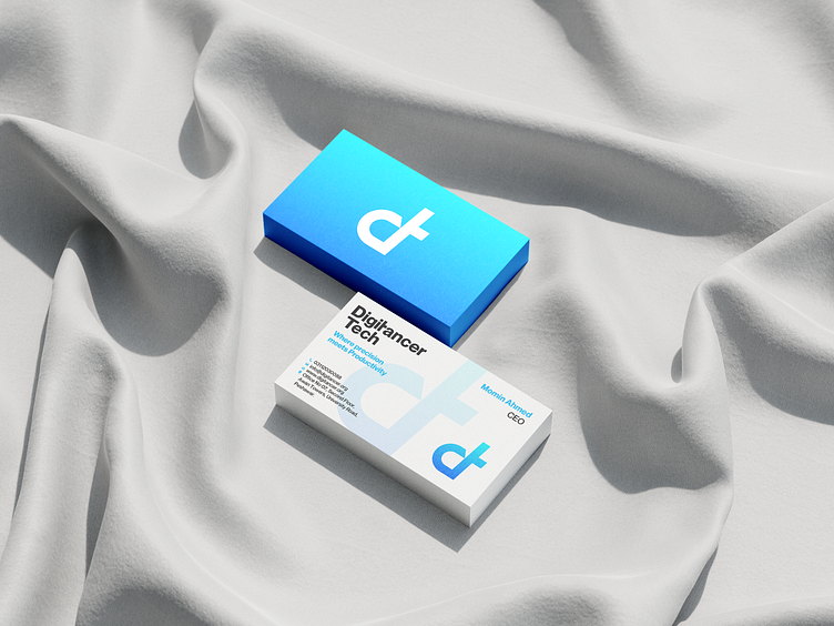
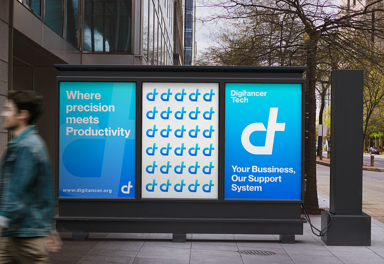
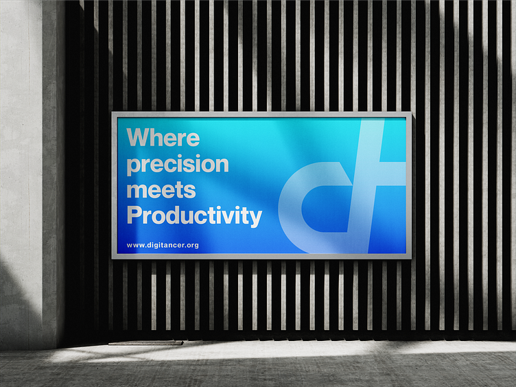
About: I preferred the letter D + T in minimalist and bold style for logomark. To make the logomark memorable and stand out at the same time I used the basic shapes in a very clever way that the logo became a masterpiece in it's own. To truly distance DigitancerTech from its competitors, I boldly embraced a contrasting color palette, a symphony of Cyan and Deep Blue that resonates with the brand values. And in the realm of typography, the choice was unequivocal - Neue Montreal. Its versatility shines brightly on both printed materials and the website, establishing a unified and visually captivating brand presence.
Enter your text here...Let's work together and elevate your brand! 🚀
Feel free to reach out via Dribbble DM or E-mail:
You can also contact me on Whatsapp:
📱 03491107701
✦ All Rights Reserved ©
If you like my work then please drop a like ❤️
Follow me on Behance
✍️ Best Quality work 💲 Budget Friendly
Thanks
