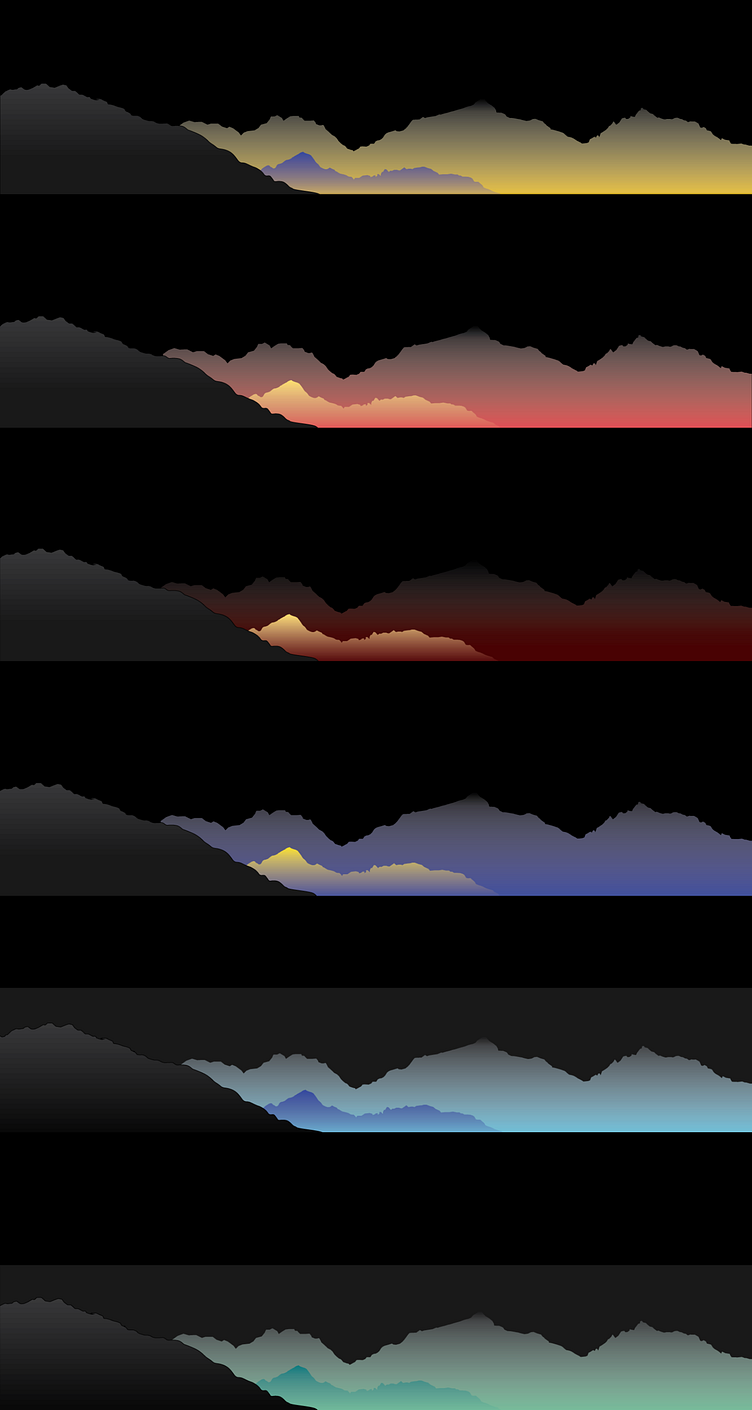
Mountain Gradient Covers 1500x300 Dark-Mode VS Light-Mode Study
Designed when I was beginning my college coursework into Adobe Illustrator,
I created these as covers for my Notion Dashboard.
The gradients were carefully chosen to either contrast or flow with each mountain. You might be able to see the differences that I experimented with.
Each color was suited to evoke both a natural and unnatural sense. Consider the first mountain (yellow & purple), the colors are likened to a sunrise yet contrast with it. They are likened more to the contrasting colors of night.
Similar is the one below it, a flush pink-red with yellow. Which contrasts directly with the dark-red mountain gradient below it.
The Dark-Mode background makes the colors pop out even more, and gives more movement with the gradient mountains - like a sunset or sunrise.
Now let's take a look at the Light-Mode covers below.
The gradient colors seem to blend in a lot better - especially with less pigmented colors (ex. yellow, blue)
The covers in general look a lot more natural against a white background than they do against a black (my observation), while the lighter gradients pop much better against a black background.
What do you think about these gradients?
Below is how they look when part of my Notion workflow.
Overall, I've really enjoyed putting these gradients together and studying how the colors affect the perspective per the light/dark background.
This was also a great project to get into Adobe Illustrator with & play around with hand-designing the shapes.
Which would you use if you needed a Notion Cover?


