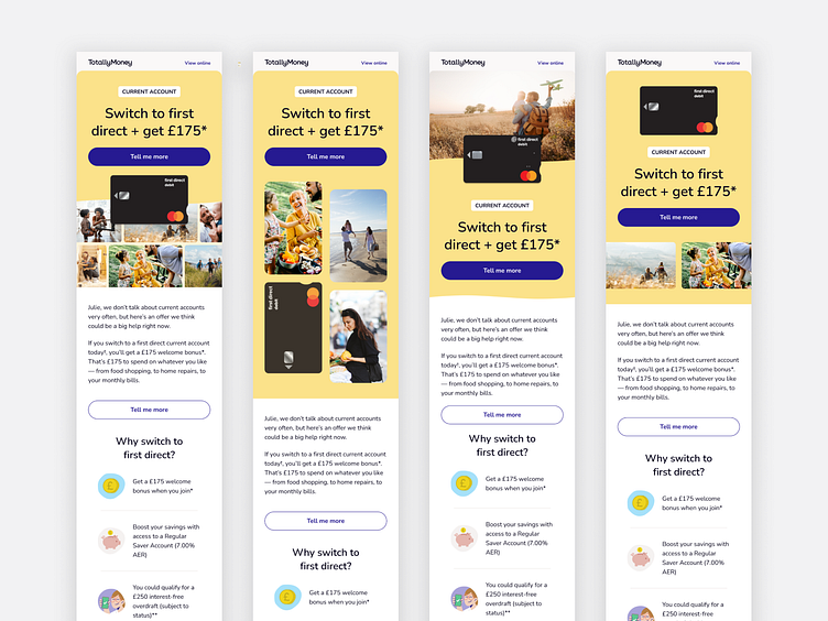
first direct campaign email exploration
Mid last year our commercial team wanted to test a new type of revenue focused campaign at TotallyMoney, which features different products ranging from current accounts, loans to insurance among others.
The campaign needed a new email layout style that differentiated it from our other sends in our customers inboxes. So I did some visual exploration on how we might structure it, you can see some of the hero explorations in mobile here.
The new campaigns smashed their OKR goal by 30% before the end of the year! I've already worked on several iterations of the email template, to see how the changes perform as well as to keep the template fresh for customers.
Programs used:
Design - Figma
More by Stina Slingo View profile
Like
