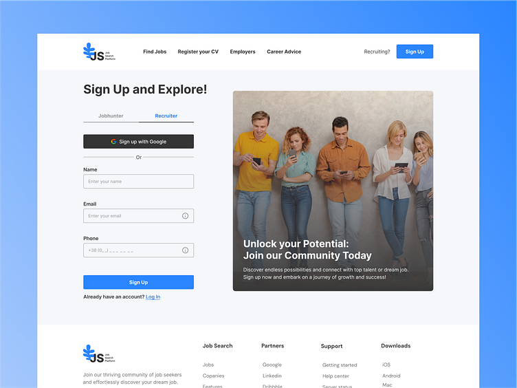
Job Platform Concept
Hello everyone!
This shot showcases the registration form for a job search platform. The primary focus is on the form for entering user details. The color palette aligns with the platform's main stylistic approach, emphasizing the primary calls-to-action.
I would be delighted to read your feedback and receive your comments.
Press L if you like it ❤️
Thank you.
I am open to your suggestions 🤠 please send your request to my email at kateryna.burych@gmail.com, or contact me via Linkedin
More by Kateryna Burych View profile
Like
