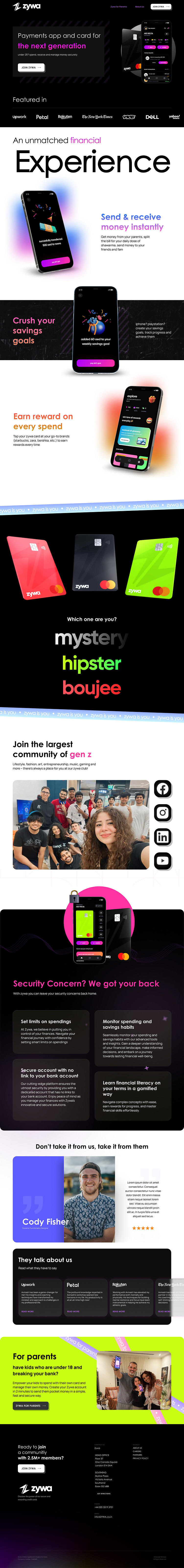
Yet Another reimagining of the Zywa website
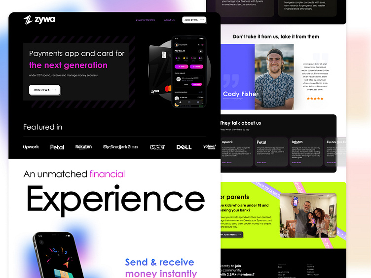
This time I wanted to build the page in a more simplistic and sleek fashion while still maintaining the use of punchy colours which is synonymous with their brand identity. The core idea was "Less is More". Check the full view below and do let me know what you think.