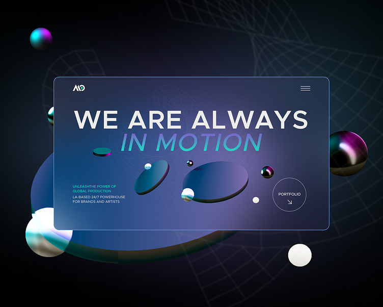
Website for a company from sunny LA🌴
New project, new achievements! Website for a company from sunny LA]🌴
I was approached by the owner of Motion bloc. For the packaging of his business.
⠀
Request: a one-page website with the most important information that customers need. To make a dark theme and wow, so that the client immediately sees not some kind of rosbeh, but a trendy technology site. Not like everyone else 🦾
⠀
🦄 Design process:
1. Good old analysis, you can't do without it. Analysis of the product, target audience, competitors
2. Site map
3. UX research and prototyping based on all insights and analysis results
4. Preparation of a mood board and UI elements. We drew author's icons for the business and a composition of 3D ellipses on the main screen. The composition looks in the direction of the cursor and the 3D ellipses follow ним🕵🏻♀️
5. Adaptive versions: tablet and mobile. UI-kit
6. Business cards and presentation > packaging for delivery to the developer
⠀
The design process was exciting and creative. Every detail was carefully worked out, each element solved its own function. Completing this project, I feel very satisfied and proud, as well as the client 💙 that (spoiler) has returned with more than one project

