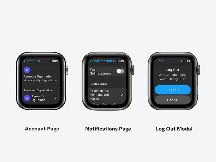
Figma Mirror watchOS app (Account Flow)
Context: The screens above include an account page, a notification page and a log out modal. Below are expanded views of the each screen.
Account Page
I chose to use a Hierarchical Navigation for the account page. This made it have a similar flow with the iOS app. It enables a user to scroll down the page easily.
Notifications Page
I also chose a Hierarchical Navigation for the notifications page. With a similar interface to the mobile app, a user can seamlessly switch "Push Notifications" on/off and the type of comments they want to see.
Log Out Modal
Using the Apple watchOS 9 Design Guidelines & Resources, I was able to create a simple modal for the user logging out sequence.
Conclusion
The three screens are from a project I'm working on in my free time. Constant practice has made me better understand the watchOS ecosystem.
Figma Mirror is top 2 my daily used app, so working on it has been a blast!
Thank you so much for reading!
Email me at abrahamphilip16@gmail.com
What do you think? Let me know in the comments.


