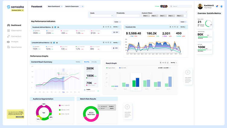
Samooha Dashboard Design Exercise.
I built this dashboard design as part of the Design Exercise with Samooha (acquired by Snowflake).
The prompt of the design exercise was the following
Design Question
Design a UI of a data analytics dashboard for digital advertisers leveraging data clean room solutions, which provides comprehensive insights into their advertising campaign performance, while allowing them to compare performance across publishers / platforms that are operating in separate clean rooms. The dashboard should enable advertisers to:
Monitor Key Performance Indicators (KPIs): Display an overview of essential metrics such as impressions, clicks, conversions, click-through rates (CTR), and return on ad spend (ROAS) for each campaign.
Track Audience Segmentation & Match Rates: Allow advertisers to analyze audience segments, attributes and respective match rates to optimize targeting and messaging strategies across publishers.
Quickly & Easily Compare: Provide functions to easily compare separate clean rooms for publisher / platforms, in order to measure how a publisher / platform is performing relative to one another.
Consider the following factors in your design:
User Flow: How can you create a seamless and logical user flow, guiding users through the various stages of data exploration and analysis across clean rooms?
User Interface: How can you design a clean and intuitive interface that allows advertisers to easily navigate through the platform and access relevant data across clean rooms?
Custom & Comprehensive Analysis: How to allow advertisers to compare analyses that are either of the same class across clean rooms or comprehensive for a publisher’s / platform’s performance.
