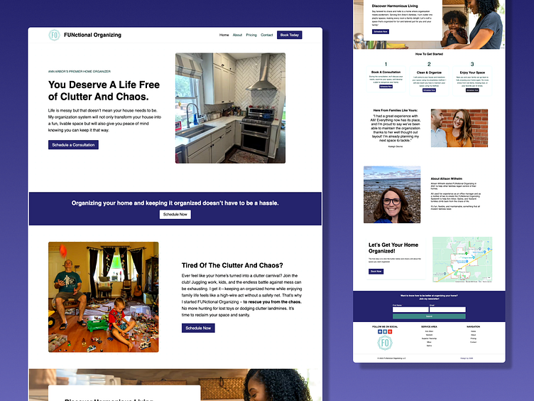
FUNctional Organizing Website
About FUNctional Organizing Website
I must admit that this was a surprisingly fun project to work on.
The project started off a bit rocky on my end. Sparse creative brief, lots of unusable photos, too small of a budget to hire a copywriter, and an industry that I knew nothing about.
It took a few conversations to really understand the difference between a housekeeper and a home organizer.
Audience
One thing that was in my favor was my client's target audience: families living in Ann Arbor, MI. This was beneficial because I spent 6 years living in the area for undergrad and grad school. I understood the community, the people, and what they'd look for in a website.
For example, I knew I would need to incorporate cultural diversity into the images. Ann Arbor, Ypsilanti, and the surrounding area is extremely diverse and they really value it.
The design would also be primarily speaking to married women with kids. As you can see from the photos that I chose, I wanted to highlight the chaos of that reality (I am a parent myself) and the desired outcome (mother happily spending time with her child in kitchen).
Technical Details
I built this site using Wordpress with the Kadence Pro theme and Kadence Blocks Pro.
This toolset has become my favorite for WP websites due to its incredible performance. Without any tweaks, its mobile performance scores in Pagespeed Insights is in the low to mid 90s... WITHOUT a caching plugin. Love this. I used to spend hours tweaking settings to get into the 90s with WYSIWYG page builders.
Still need to improve a couple more things to get all 100s but switching to Kadence has saved me so much time and stress.
Color Palette
During my competitive research, I found that a lot of other websites either went very corporate with a blue/white/silver palette or they went very feminine/cutesy with lots of pink and light purple.
Because of this, and the colors of the logo provided by the client, I decided to choose a palette that was in the middle of the two: indigo + middle blue-green.
Although it's hard to tell in the shot below, there is a pale middle blue-green polka dot background that adds a layer of fun to the design.
The reason the button is grey is that my mouse was hovering over it when I took the screenshot. XD
Outcome
The client loved her new website and I'll update this with the testimonial as soon as I receive it.
Also looking forward to updating this post with results after a couple months.


