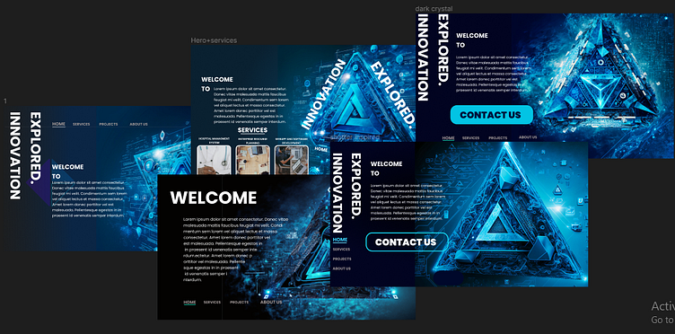
Modern heroSection variations
The average person will evaluate a site with regard to how it made them feel with in a split second upon first glace of the hero section. Though fancy motions and animations capture the audience (usually after 300ms upon page load); layout, hierarchy and image choices are the ones' that leave a long lasting impression and ease of navigation.
Here i tried to experiment with different type layouts and hierarchical placements of components void of any animations (though tempting) to try and break out of the hero section layout clichè we all see nowadays.
More by Eyob Berhanemeskel View profile
Like
