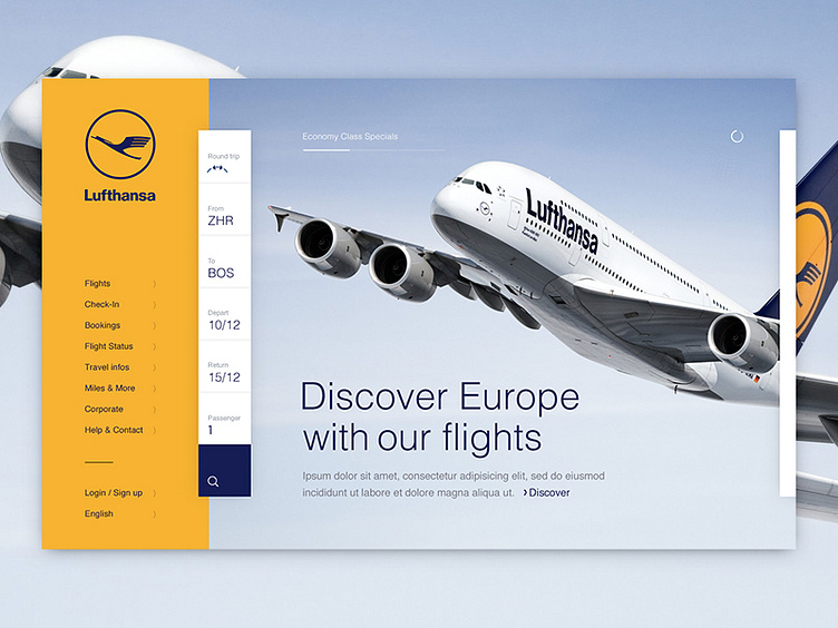
Lufthansa Homepage Concept
Dear Friends,
I used to work on another airline site this year, where I tried to introduce a different type of flight search widget (vertical). Unfortunately the client didn't want to go that bold, but I'm still convinced that the concept could work really nicely. So I took the design and rebranded it a little with a airline I really like!
Look at that amazing logo! Love to hear your thoughts :)
Thanks!
More by Neonite Interactive View profile
Like
