Purchasing Flow Redesign, Marketplace Puntos Colombia
Hello everyone! 👋,
Today I want to share one of the projects that I'm most passionate about: the optimization of the purchase process for the Puntos Colombia marketplace.
Overview
Puntos Colombia's marketplace is the digital asset that generates the highest profitability for the program, constantly seeking improvement to foster greater engagement.
One of the most important goals has been to redesign the buying and payment experience, based on findings from evaluations and the new technological integrations from VTEX, the platform on which we designed the marketplace.
Background
Puntos Colombia stands as the foremost loyalty program in Colombia, empowering users to accrue and redeem Points at partner stores through Bancolombia credit cards.
I Lead the End-to-End Design Process
As the experience team lead, I coordinated the complete redesign, including the new payment process. Among the major achievements, I highlight:
Experimentation Opportunities: Employing tools such as Maze, Useberry, and a refined points reward system, I crafted adaptable research formats, fostering co-creation with users throughout testing.
Rapid Prototyping and Testing Processes: I implemented streamlined processes for rapid prototyping and testing, facilitating continuous iteration to refine the new experience within the project's stringent timeline.
VTEX Best Marketplace 2023 Award: Our efforts were recognized with the VTEX Best Marketplace 2023 Award. The platform recognized growth in sales, orders placed, and product adoption. For further details, please refer to this link award.
Understanding the Problem
I initiated the first session with my team, joined by the Vice President of Product and Business, the E-commerce Business Manager, and the Product Owner of the marketplace, to delineate business and user experience requirements.
Adhering to the principles of Design Thinking and the Double Diamond Process, I conducted ethnographic interviews with another UX designer, engaging all stakeholders and 16 users from the customer database provided by the marketing team. Our findings led us to the following conclusions:
The marketplace must actively promote point accumulation, addressing the users' primary concern of feeling that they accumulate too little.
It is necessary to reduce the transaction time, optimizing the customer journey and leveraging the new technological integrations from VTEX.
Three critical aspects of the user experience to measure and improve are: performance, preferences, and emotions.
Product Vision
Building upon these insights, I delved into marketing metrics sourced from Google Analytics, Microsoft Clarity, and Qualtrics, analyzing user behaviors through indicators such as traffic, interaction rate, and dwell time. This comprehensive analysis led to the definition of three key objectives:
Decrease transaction time by 24%.
Increase user recurrence by 12%.
Enhance user perception of point accumulation, fostering increased redemption and conversion.
In pursuit of these objectives, I conducted additional sessions with the technology team to delineate the scope of new integrations and understand their limitations. With all this information, I meticulously reconstructed user journeys, establishing them as the cornerstone for achieving our outlined objectives.
The solution: Defining a New Customer Journey
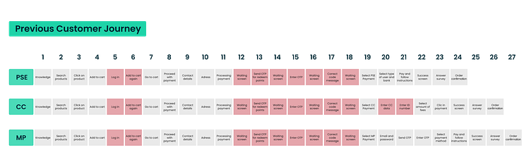
The purchase journey is influenced by three variables corresponding to different payment methods through which a transaction can be completed. After numerous iterations and collaboration with stakeholders, we successfully streamlined the journey, reducing the maximum number of steps from 27 to an optimal 11 in their ideal versions.
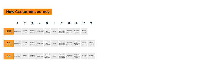
With these new journeys, several significant changes were introduced, among which I highlight:
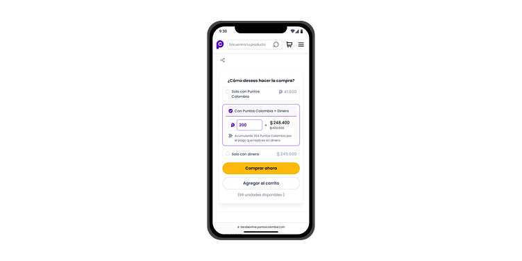
Elimination of OTP for point redemption.
Introduction of a feature allowing users to store their payment methods.
Integration of a quick purchase button leading directly to checkout.
Prioritizing and Redesigning the Most Important Features
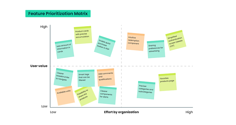
With the new journeys and a well-defined vision for the enhanced user experience, the next step was a comprehensive redesign of the website. To guide this process, I created a prioritization map, strategically targeting features that proved more complex for users and introduced friction into the purchasing process. This prioritization was informed by insights from the marketing team (a different prioritization matrix was created for the development team).
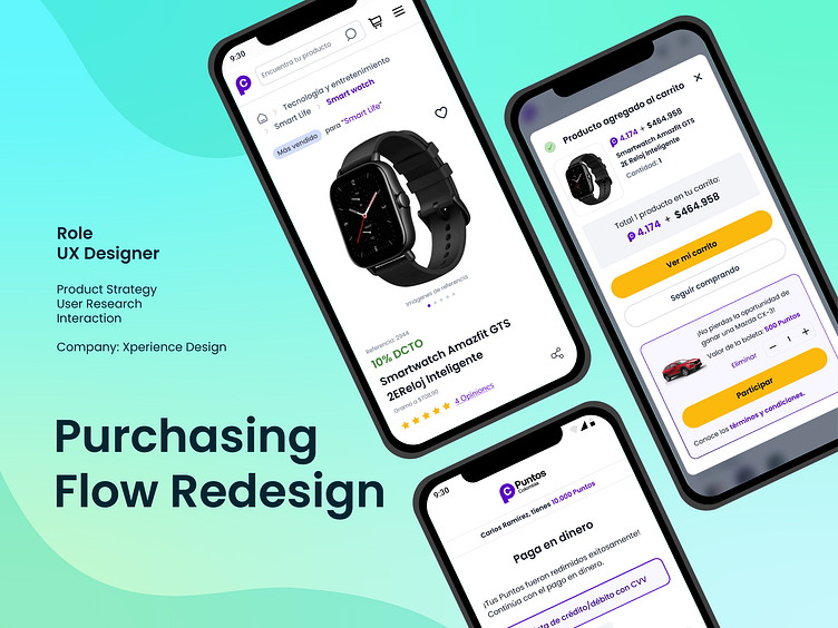
All redesign proposals were executed in hi-fidelity wireframes. Some of the final designs were:
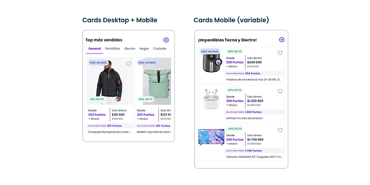
Redistribution of information on the product card to highlight point accumulation.
Redesign of the redemption component with visibility of accumulation and incorporating a quick purchase option.
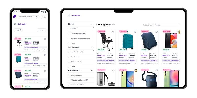
Smart tags to filter products with selling points, such as "Free shipping."
Testing
At this stage of the process, conducting tests agilely was crucial. We allocated one day each week to conduct tests in collaboration with my UX colleague, and we adjusted the designs with the assistance of two UI designers. Fortunately, I experimented with new ways of conducting tests, including moderated sessions involving 4-8 participants to identify issues with the designs, design real-time solutions, and iterate during the week with many more ideas.
With the help of the marketing team, we tested it with +100 users to assess preference metrics. The test objectives were defined as follows:
Comparison of alternative designs.
Frequent use of the product.
Completion of a transaction.
Appropriate metrics were defined for each objective, including:
Task success.
Task time.
Learnability.
Efficiency metrics.
Issues-based metrics.
Self-reported metrics.
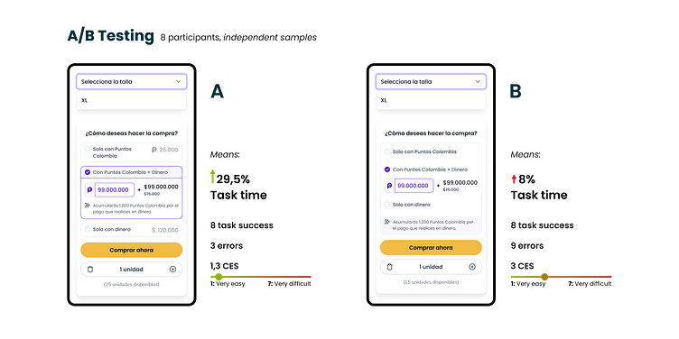
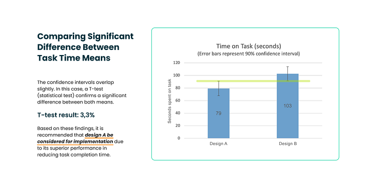
To ensure the success of every adjustment in the marketplace, informed decisions were made through rigorous statistical tests when necessary. In this case, A/B testing of the redemption component revealed a statistically verified performance difference between designs, confirming the superiority of one over the other within the 90% confidence interval.
Development
All designs were shared for inspection using Figma's Developer Mode, and user stories with acceptance criteria were meticulously documented in Microsoft Azure. This collaborative effort involved developers and the Product Owner. The marketplace is built on VTEX.
Results and takeaways
The acknowledgment of the Best Marketplace 2023 Award from VTEX, the digital commerce platform powering the Puntos Colombia marketplace, has been a gratifying achievement for the entire team. VTEX, operating in more than 38 countries with over 3,400 active marketplaces, adds significant prestige to this recognition.
From my experience in this giant project, I would like to highlight the following key takeaways:
Agility Towards Business Goals. Embracing an agile-friendly approach, combining Lean and SCRUM methodologies across all processes, and the team's openness to adopting them, proved instrumental in saving time and costs.
The Power of Experimentation for Growth. Innovating in the design and execution of tests yielded profound data insights swiftly. This approach facilitated the creation of assertive solutions that were well-received by both users and the company.
Customer-Centric Mindset for Business Outcomes. Prioritizing a customer-centric approach, converting user needs, pain points, and desires into opportunities, significantly contributed to the company's goal attainment and organic growth.
If you like it, don't forget to press L
Have a project? I'm available for hire
For quick inquiry feel free to add me on
