Esti App Icons. How to 2

Tips to Create Icon Set, pt 2
The first part is here
💡 Check your icon concepts inside design
Again and again! It helps to form it finally 😇
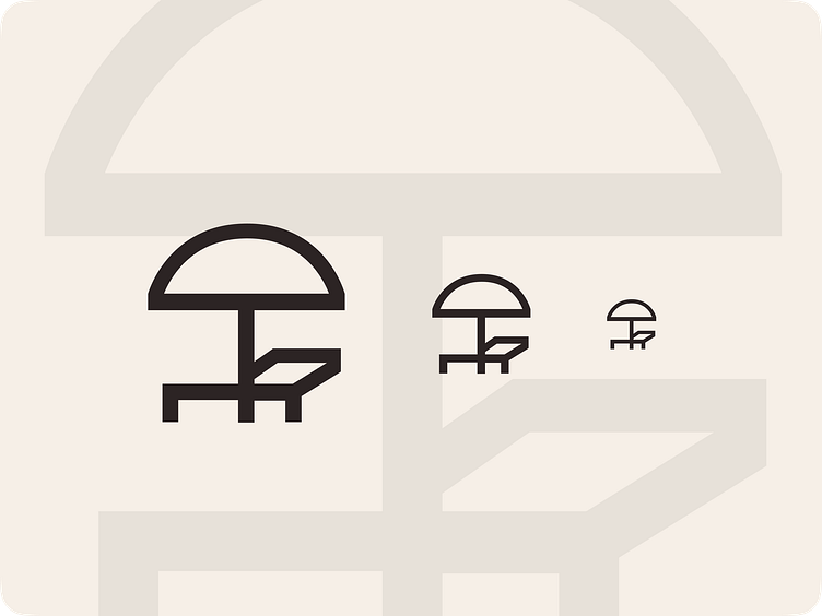
Visual compensation
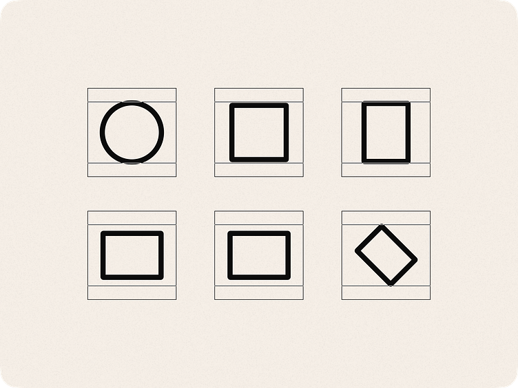
I highly recommended to fit icons into a square.
...but If an icon implies an elongated shape, visually compensate it.
⚖️ To do this, experiment with size and length adjustments to ensure the icons have an equal visual "weight."
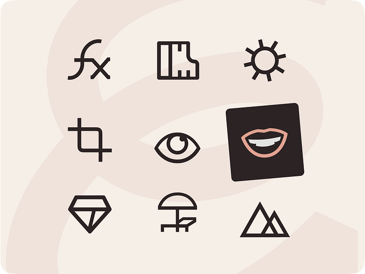
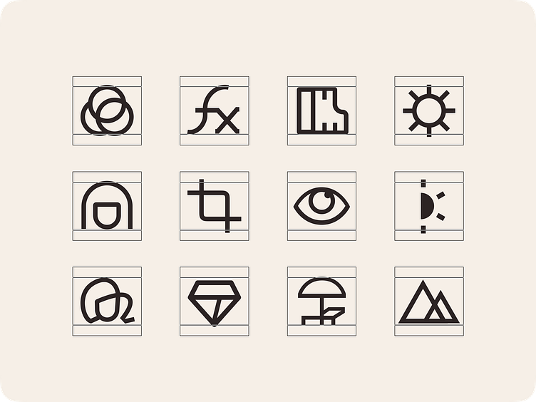
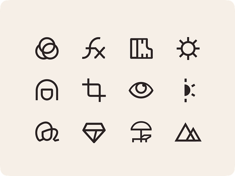
Turn this shapes into icons. Try to aim as square as possible!
💬 In the Esti app, due to its nature, I allowed the icons to be bold and playful while maintaining a sense of rigor. What do you think?
***
💡 Scalability
Ensure icons look good at any size without becoming too complicated.
Otherwise, you must be draw it in any sizes, which will multiply the time and complexity of the icon system.
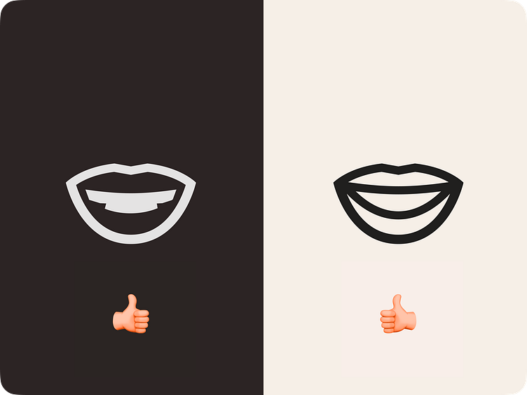
💡 White color is not black...
Okay, i just show you what happened when i'll try to revert teeth icons color.
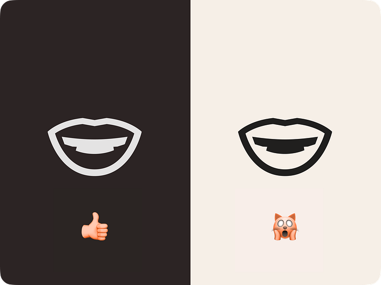
You have 2 ways to solve this problem:
a. Try not to draw icons when white color metaphor is dominates. (Like a teeth)
b. Draw alternative view on the white bg👇
***
...get more advises in upcoming posts.
Follow so you don't miss out.
Also, your likes and comments will help me understand how useful this is for you.
