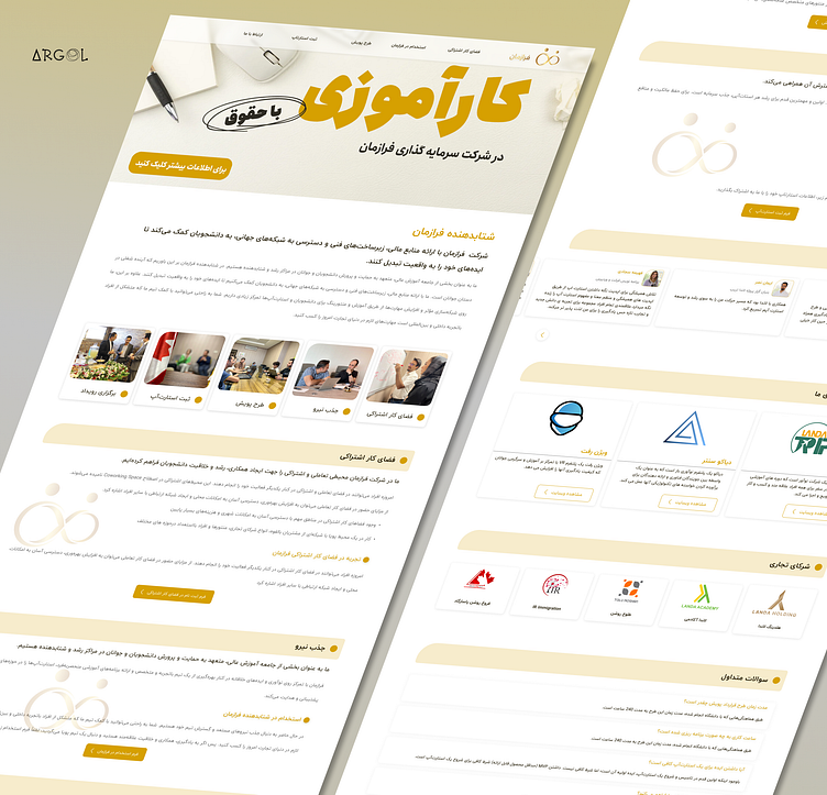
Farazaman Landing Page
Hello Dribbble friends!
I am proud to present the user interface and experience design for the Farazman website, aiming to accelerate a dynamic company for students and entrepreneurs.
In this project, I employed vibrant colors and typography, striving for a minimalist design. I paid close attention to maintaining a consistent design system and content organization for a visually pleasing result.
The website features several registration forms, presented through pop-ups to save space and provide a seamless user experience. Additionally, user comments, feedback, and connections with Farazman and links to partner companies are incorporated.
Overall, the site is designed to be minimalistic and user-friendly, meeting the client's requirements.
I would be delighted to hear your thoughts and feedback.🌟🥰
Feel free to reach out for collaborations or further discussions!✨

