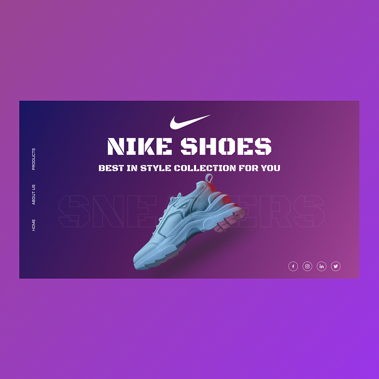
Nike Gradient Soles Landing Page
In this project, I infused the timeless appeal of Nike with a modern twist. The landing page design for Nike features a sleek and minimalistic layout, with gradients stealing the spotlight. By embracing user-centric gradients, the design not only adds dynamism but also keeps the interface clean and engaging. The focus remains on the product, allowing users to effortlessly explore the world of Nike with a touch of vibrant sophistication
More by Madiha Muskan View profile
Like
