Fitness Daily Summary
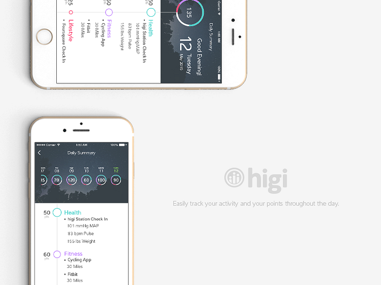
Our team wanted to incorporate a more consistent use of imagery in our product and dial back on our dependence of color useage. Photography and illustrations helped balance the white space in our UI design, preventing it from becoming too clinical and sterile/ cold. Then we were able to add splashes of color to bring attention to the important information. After a few concepts we began incorporating the new look throughout our products. The result was a much more mature and clean look with a better hierarchy of information.