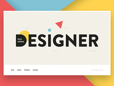
Start Screen Concept
Hi dribbblers,
It's time for a new shot :)
Here's start screen concept for a new personal website. It is a pointing where a user starts his journey at future gozha.net site.
Tried to keep it bold and straightforward using only enough information to get what it is about.
What do you think? Does it look catchy and laconic?
More by Olia Gozha View profile
Like
