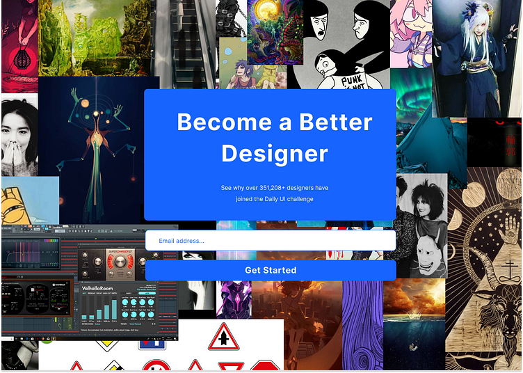
#DailyUI 100 : Redesign Daily UI
For this last one I am running out of time and finishing it right before I go to the hospital. So I just decided to literally throw stuff at the wall for the background, taking my old inspiration images folder.
But yeah, I always thought the plain white background of the normal website was boring, while it allows you to do all kinds of different challenges, hone your UI skills and take you outside of your comfort zone. So I thought a patchwork like thing would be more appropriate. Maybe different images instead of the images folder of some random reclusive "artist", but that's the idea.
100 challenges later and maybe I have learned to be more confident in Figma, but the impostor syndrome is still there. There is probably much more to do before I can get a real UI / UX designer job ? But I am glad I have finished it and done every single one, I am also very glad to have completed the challenges before the end of the year, otherwise it would always have irked in the back of my mind.
