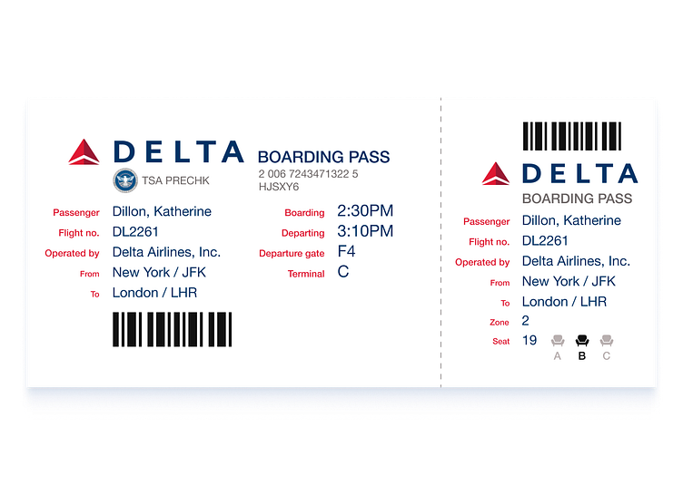
Daily UI (24/100): Boarding Pass
The UI challenge I'm tackling today is a redesign of a boarding pass. I thought that this would be one of the easier ones. After some research I realized that this would actually be the hardest one so far.
Boarding passes are handled and seen by at least 2-3 people. Typically the top 1/3 of the pass is meant for TSA and the bottom 1/3 is for airline personnel. Everything in the middle is meant for the passenger.
I've always found it frustrating to deal with a boarding pass. Okay, it's not so difficult that I couldn't figure it out but it did involve some cognitive friction which always slowed me down as I scanned it. Also the horizontal presentation of the info never made sense to me.
I decided to keep the thirds design but opted instead to have the information broken up into containers that moved from left to right as opposed from top to bottom.
The first 1/3 is still designated for TSA. However, this section - coupled with the 2nd section - is meant to be seen by the passenger as well.
The final third is also meant for the passenger but also an airline personnel who would (at least in the past) collect the pass stub. This gives an airplane crew member a count of all the passengers in order to make sure that everyone was onboard.
I did a lot of research and came across a lot of designers who decided to take this challenge on (apparently designers get really mad when it comes to the current designs for boarding passes) in order to have a better understanding as to the hierarchy of a pass.
I also consulted with ChatGBT regarding the necessary elements I wouold need for a boarding pass (took a couple of prompts for it to understand what I meant by the placement of info in relation to the people handling the pass).
I'm pretty happy with the result and think that I more or less nailed the solution. I'm particularly happy with the addition of the seating icons which I think makes it easier for everyone to understand where their butts are supposed to go.
But again, anyone see something that could be improved - lacking of info or poor layout - don't hesitate to let me know.
And if you like it you can let me know that, too!
UPDATE: One of the comments suggested that I add two things: a TSA Pre-check line and a terminal number/letter. Good suggestions so I did it. The above design is the newest version.
