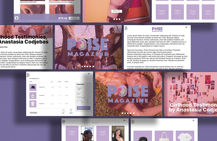
POISE Magazine Web Design
Due to my interest in creative magazines, I made up my own magazine under the name POISE, which is a compilation of all my interests in design, photography, art, fashion, media, and storytelling, through effective creative and journalistic writing. It is important to acknowledge that curation isn't only important in the exhibition spaces. A magazine, whether print or digital, has to effectively create pairings that make space for unique experiences of interacting with it.
My initial process was developing my personal magazine's visual identity that relay what it stands for. Seen as the branding of it was done a long time ago, in the Spring of 2021, I wanted to go back to it to strengthen with edits I am able to make due to my improvement in skills.
My initial thought at the time was having the textured background of the logo's 'O' colors to create unity, as well as bring interest to the web design. However, now that I look at it, I think it only overwhelms and crowds the site. The images also look too flat to me, and perhaps I should have attempted to use even brighter and visually exciting images to represent the magazine's front pages. In the new design, I am still emphasizing the main goal of my older design, which is to interweave the different practices of art, photography, fashion, design, and journalism. I aimed to figure out an effective way to categorize and label them on the site.


