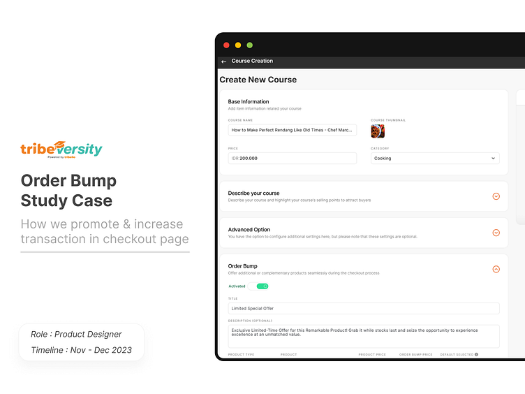
Order Bump - UX Study Case
So, Tribeversity is a learning platform where content creators (teachers) provide courses, and learners, typically followers of these content creators, come together to purchase courses here.
Course purchases on Tribeversity are quite good, but outlier products aside from the main product promoted by the Chief (content creator) are less visible to students. This situation results in less revenue for the Chief and less spotlight for other courses.
Here, I've tackled several issues related to product promotion and insufficient visibility of course purchases at Tribeversity. In this endeavor, I closely collaborate with the product manager, Development team, and upper stakeholders.
Role, Team, Timeline & Tools
My role here is as a Product Designer, and I am assisted by several great people, such as the Product Manager, the Developer team, and then there are also top Stake holders.
For this timeline, it is in the end of 2023, to be precise in November - December, and the tool used is Figma
Background
The visibility of courses stands as a crucial pillar for creators on Tribeversity, as it drives revenue and demonstrates that a user has more than one course available for checkout.
However, the current challenge lies in users being uncertain about how to view their courses and proceed with checkout for more than one course on Tribeversity, aligning with the primary course criteria they've selected.
We aim to resolve this issue because, from our perspective, we aim to generate larger revenue streams. Additionally, for users, we want them to discover similar courses that can be purchased in conjunction with the primary course created by the Creator.
Research
So here, I conducted qualitative research with several creators on Tribelio, aiming for an in-depth exploration of their issues.
Some insights I've discovered include:
Customizing the wording in recommended products
Allowing users to purchase 2 or more products from the recommended items
Placing recommended products on the checkout page to entice users to buy similar items
Difficulty in promoting other products once users reach the checkout page
Seeking additional revenue from secondary products apart from the main product
Providing discounts for promotional products displayed on the checkout page of the main product.
Benchmark
Udemy
Here, I benchmarked Udemy to understand how they promote products when
users add items to their cart.
ClickFunnels
I benchmarked ClickFunnels to learn about their method of order bumping a product directly from the front end, specifically through the landing page. This aligns secondary products with the main product.
Gumroad
From Gumroad, I learned how they promote products on the checkout page, recommending not only the creator's product but also products from other creators.
Define the Problem
Then we asked “How can we effectively promote other products to customers and, as a result, make it easier for customers to check out those products?”
Product Principles
User Satisfaction
Here, we aim to create a feature that promotes the creator's product while facilitating an immediate checkout for the buyer.
Fit for Purpose
In this context, our primary goal is to ensure that the main scale of the feature is fulfilled. The crucial aspect is to achieve the creator's primary objective, which is to promote other products to the customer and simplify the checkout process for the promoted products
Product Use Cases
Creator
Product Promotion Addition in Main Product
When creating a product, we can include products we want to promote within the main product. Users can directly checkout the promoted product from the checkout page. Here, creators can insert promotional sentences for their promoted products and display discounts to entice users.
Buyer
Purchasing Promoted Products on Checkout Page
When buying or checking out a product, users can immediately purchase promoted products from the checkout page of the main product.
After carefully analyzing the issues we encountered, we transformed these challenges into a comprehensive flow to address the identified problems
Creator Flow
Buyer Flow
Creator Side
Buyer Side
Result
At the moment, the features are still in development by the Development team. Perhaps later, once measurable, I'll share the outcomes here
Lesson Learned
Here, I've learned how benchmarking can expedite the design process by examining existing products and applying those insights to our own product.
Thank you for following along with my case study. Ciao!


