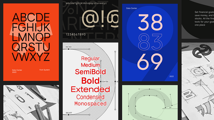
Font design based on multi terminal data scenarios.
General-purpose fonts are more suitable for expressing textual information in daily media such as print media and content media. However, they cannot effectively convey and interpret specific information in professional data products. Designing a dedicated font that focuses on data products has been an ongoing effort for us as we strive to address this challenge.
1.Classify the different forms of arcs to seek a more rigorous visual consistency, especially in the nested relationship between 3,5,6 and 2,9 in order to achieve a more perfect visual harmony and unity.
2.Differentiate the numbers 3&8, 6&9 more clearly in the design. Ensure high legibility even at small font sizes and extreme conditions.
All number widths are based on ‘0’ to achieve a more extreme coordination and visual balance. This is especially important for the presentation of large data tables in our product interface.
1.The angled design of lowercase letters can provide more visual space, preventing the font from appearing too narrow.
2.It can effectively fill the visual grayscale at small font sizes and extreme conditions.
3.The low contrast and larger counters of DataCenter-Font ensure high legibility even at small font sizes and under extreme conditions.
General-purpose fonts are more suitable for expressing textual information in daily media such as print media and content media. However, they cannot effectively convey and interpret specific information in professional data products. Designing a dedicated font that focuses on data products has been an ongoing effort for us as we strive to address this challenge.


