TBS Logo: Though the Lens of Type
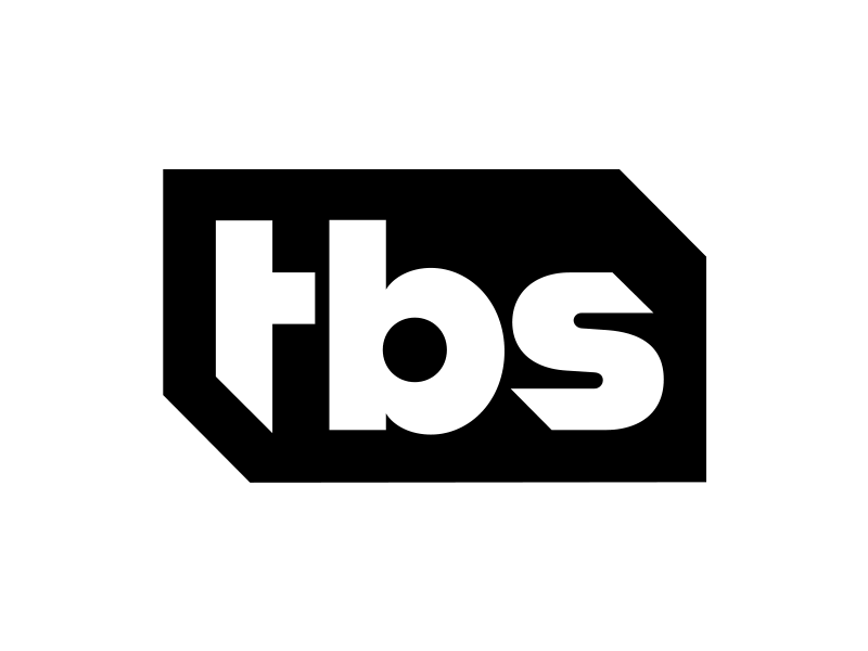


TBS recently launched a fun and quirky rebrand, which I dig. One of the things I noticed about the new logo is quickly becoming a norm in the graphic design world—relying too much on a grid instead of optically correcting type.
The images here show some common problem areas that designers can forget to pay attention too.
Further Reading on the Intricacies of Type:
Typeface Mechanics 101 and 102.
Disclaimer:
1. Designers redesigning logos can be dumb. I get it. I realize this rebrand is already in full effect, and this is not me trying to do a better logo. It's merely an example to show some of the problems designers can run into when relying too heavily on a grid. My changes might not even be the proper solution here, but they're just a quick revision to show what the optical corrections could look like.
2. This post is in no way intended to slam @Sean Heisler (I think his work is pretty chill).