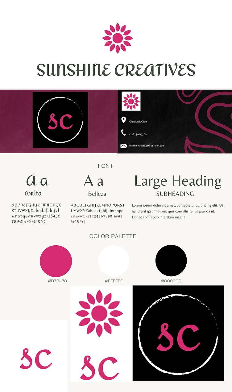
Brand Style Guide
I have been studying in-depth about the elements and importance of branding and showcasing what someone wants their business, brand, mission, and vision to represent and look like. It took roughly 1 month to brainstorm ideas, generate my color palette, create a unique feel to my logo and icons I carefully chose. I wanted something unique yet simple and professional. I also chose this specific font to create a sense of sophistication and elegance. I originally used the typical yellow and white colors for the sun but after testing a few various color palette ideas I envisioned, these colors clicked well together and visually and emotionally made sense. I chose the Amita and Belleza fonts because the Amita font felt elegant and unique while Belleza was perfect for simplicity yet a hint of sophisticated.
