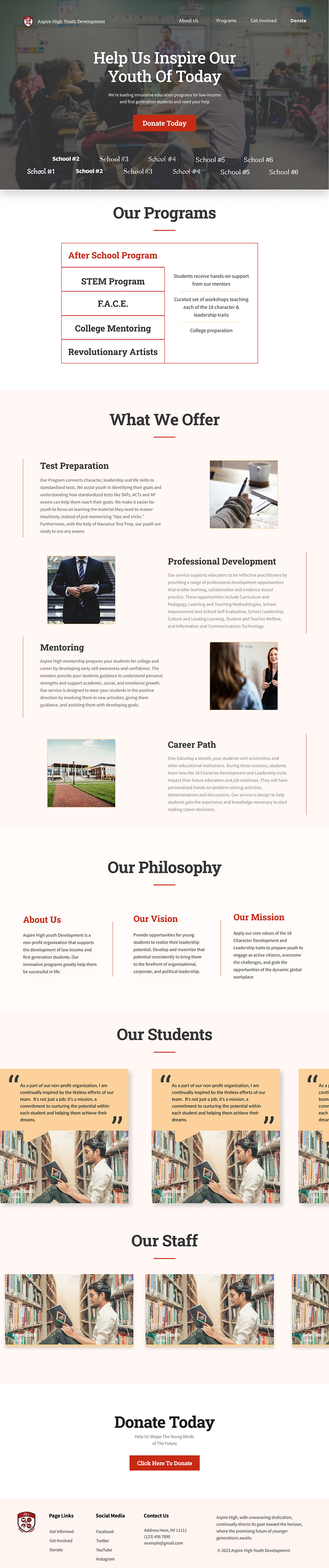
Non-Profit Education Site (Aspire High Youth Development) WIP 2
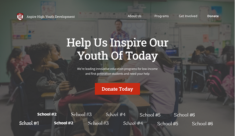
This is my newer design of my Internship website. The design definitely has the leg up, with having a more cohesive color scheme, with the red being the main color matching the logo, and a manila secondary for a more educational/office feel. I made sure to use hard corners and straight vertical and horizontal lines to represent trust and a serious demeanor. The serif font for the titles also adds onto the school/academy feel. Perhaps there's something to say about leaning more into the non-profit aspect over the educational one, but I think it works either way.