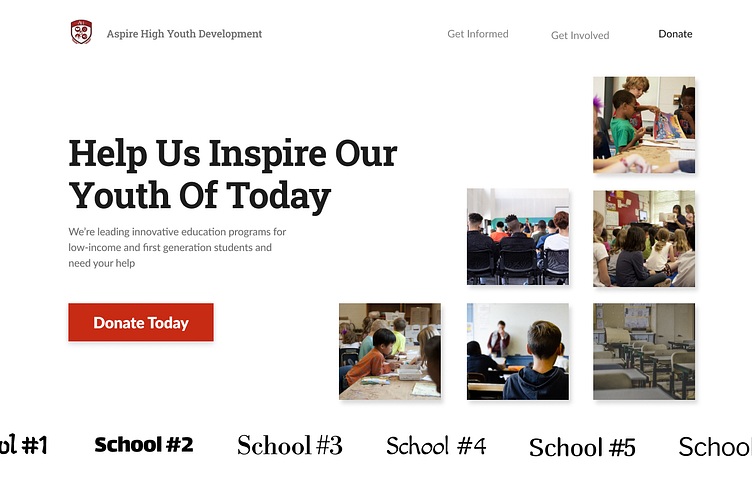
Non-Profit Education Site (Aspire High Youth Development) WIP 1
This is one of my first website designs for my Internship! I really leaned into the idea of stairs, as they represented moving up, as well as being a good shape for having a strong foundation with their vertical and horizontal line pattern. This web design was scrapped because a lot of the elements really didn't mess well together, and I really began to see that as I worked on more designs. It was still quite enjoyable though.
More by Yavuz Yurtseven View profile
Like

