Homepage Concept
Hi Friends,
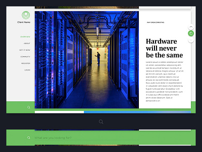
The last one from me today. I worked on this concept earlier this year. The idea was to split up the content in really large cards with nice photos and type and then introduce technology and informations piece by piece while the user is scrolling through. The green button was there to reveal all cards in a grid for quick navigation.
Hope you like it :)
More by Neonite Interactive View profile
Like
