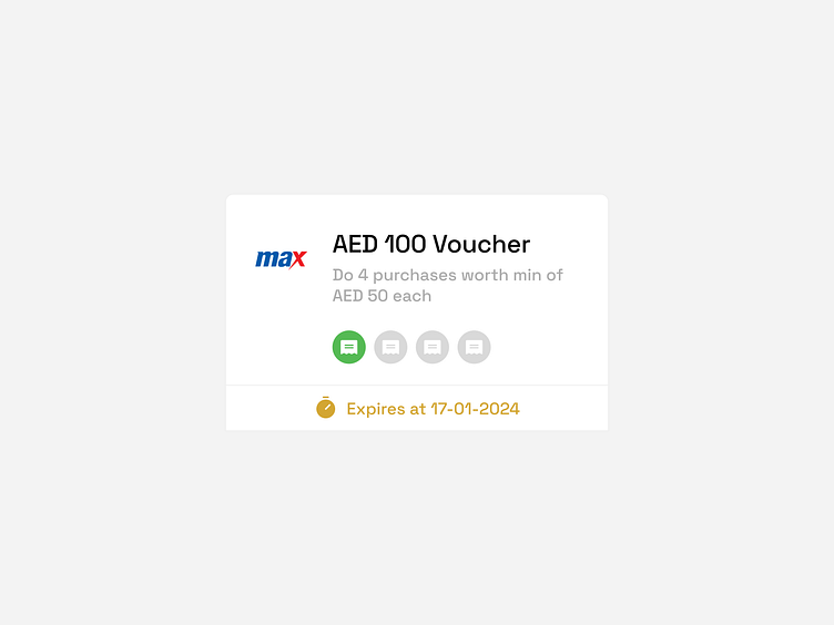
Max Voucher UI Card: Clarity in Savings
Spotlight on a voucher UI card for Max — designed for clarity and user engagement. This minimalistic card clearly outlines the voucher's value, usage requirements, and expiration date, ensuring users have all the information they need at a glance for a seamless shopping experience.
More by Shebin Joseph View profile
Like
