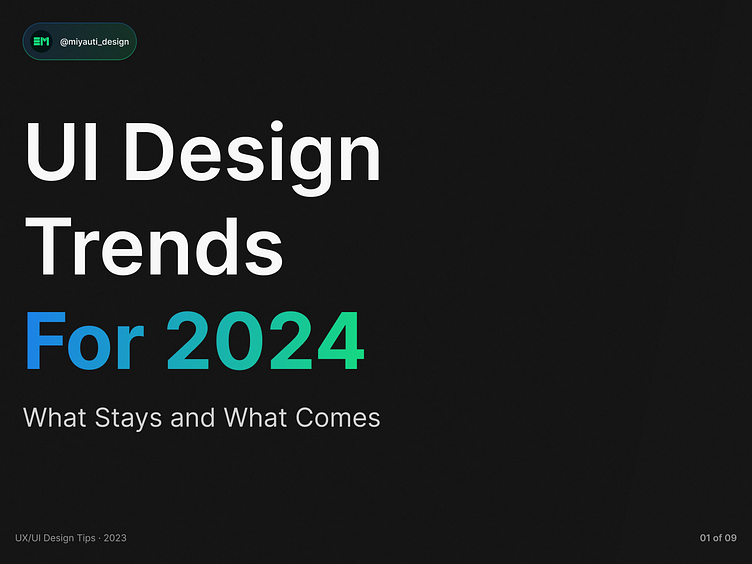
UI Design Trends for 2024
Oh yeah, darling, it is that time of the year! It’s holiday season, we finally get to rest a bit of all the hard work and projects developed throughout the year, and enjoy peaceful moments before chaos unravels again in the next year. It is also a time that most of us designers use to prepare for the next hunting season - most of us set goals, challenges, and objectives, trying to pave the road for success.
With that in mind, we notice some design trends that tend to arise every time a new year comes in. Respecting some kind of human cycle, some things stay, and others go out, giving space for new ones. And getting a head start on those trends can be of huge benefit for those who pursue triumph in the next 12 months. So to help us all, here are some bets on design trends for 2024.
Big Gigantic Headlines
This design approach emphasizes the use of large, attention-grabbing typography to instantly engage visitors and communicate key messages. They were used a lot in 2023 for heroes and key features sections, and I can safely bet this trend will carry over to 2024.
The oversized headlines serve as focal points, guiding users through the content and creating a visually stunning first impression. This trend is good not only because it enhances the aesthetic appeal of websites but also plays a crucial role in optimizing user experience by providing clear and concise information.
AI Usability and Aid
Another significant design trend that has exploded in 2023, and will be carried for 2024 is the integration of AI Usability and Aid in our processes. As artificial intelligence continues to advance, designers are leveraging its capabilities in helping to enhance user interfaces and streamline interactions.
From personalized recommendations to predictive search functionalities, AI is being seamlessly integrated into web design work to anticipate user needs and provide a more intuitive and efficient browsing experience. This trend represents a shift towards user-centric design, where technology acts as a supportive tool to understand and cater to individual preferences.
Bento Grid
Another fairly recent design trend that got more exposed at the second half of this year are the bento grids. They are inspired from Japanese’s bento meal style, which are small food storing plastic containers, usually rectangular, that are practical for eating in a day-to-day basis (they got so famous that even in Brazil, where I live, I can buy to eat them on lunch or dinner).
Along with the Bento idea, there’s the grid, which uses from the fact that the Bentos are built in rectangular shapes to organize them into areas, displaying information into different sections. This layout option is a nice and clean solution for displaying various pieces of information, and when applied with a hierarchy logic and other important design concepts, can make up for a functional and aesthetically pleasing screen. This trend, if well-used next year, can be a game changer for a lot of applications and interactive interfaces.
Custom Illustrations for Web
Web designers in 2023 increasingly turned into Custom Illustrations to inject personality and uniqueness into their projects, and will keep doing so in 2024. Custom illustrations offer a distinctive visual language that helps brands stand out and communicate their identity effectively, bridging a huge gap between the users and the brand sometimes.
Whether it's hand-drawn elements, playful characters, or bespoke graphics, custom illustrations contribute to a memorable and authentic user experience. This trend is a testament to the growing importance of storytelling in web design, where visuals play a crucial role in conveying narratives and connecting with audiences on a deeper level. If you’re looking for a way to make your first project in 2024 stand out, this is surely one of the safest ways.
Custom Blurred Gradients (specially on dark mode)
Again and at last, this is a trend that has taken over the internet in 2023, and will again have a huge spot in 2024 due to how easy it is to replicate, and the impact it has on our designs' aesthetics. The Custom Gradients as a background enhancement for special interfaces (such as hero, CTAs, featured sections) add depth, dimension, and a sense of dynamism to any place you have them in. There’s also a plus when noise, and blobs are used in this process to give it even more dynamism.
Designers are experimenting with unique color combinations and transitions to create visually striking and immersive experiences. Custom gradients not only add a contemporary touch to web design but also allow for more creative expression, enabling designers to evoke specific moods and emotions through the careful selection of color gradients. This trend marks a departure from the minimalistic approach, embracing a more lively and expressive design aesthetic.
In Conclusion…
At the end, every topic discussed here might or might not happen next year, but regardless, it is time to celebrate our hard work this year! Let’s not forget that these trends are a small of this awesome design community that has been growing these last 12 months. If I had to bet on any major design trend, it would not be any of these listed, but in the constant growing of our community and demand over the world. This year I specifically was able to testimony how UX/UI is changing people’s daily lives, and it’s the trend I want to follow next year, along with everything else of course.
And you, what do you think? Do you agree with these next design trends? Share your thoughts on this post to enrich our discussion! Remember that you can also always reach me at:
And if this is the last article write this year - happy holidays for all of you!


