Elixir Coffee-shop landing page
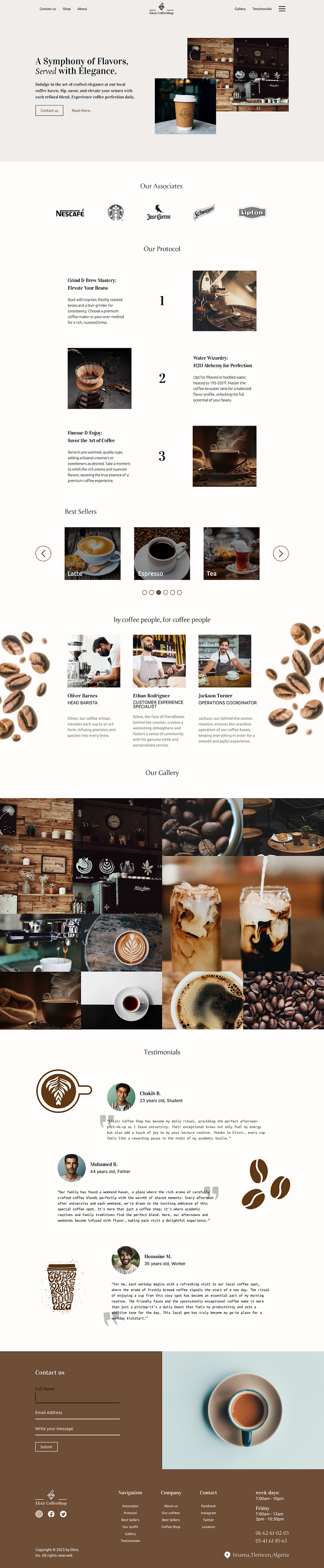
# this is my first try as a web and a UI/UX designer i approached this landing page with an elegant and luxury theme with serif fonts and high quality images.
# in this type of websites we usually don't use shadows and border-radius to showcase the serious side of it but this rules are not always applicable like the testimonials pictures.
# surely the website has no sense because i tried to apply the design principles that I've learned like colors, layouts, hierarchy, fonts... and all the content is generated with chatGPT.
# i really want some feedback from you'all; what i would have done instead of this and that, or if there is a mistake in the design principles... I'll be glad to receive any good or bad critics and hope you like it, and may be it will be a source of inspiration to someone.
