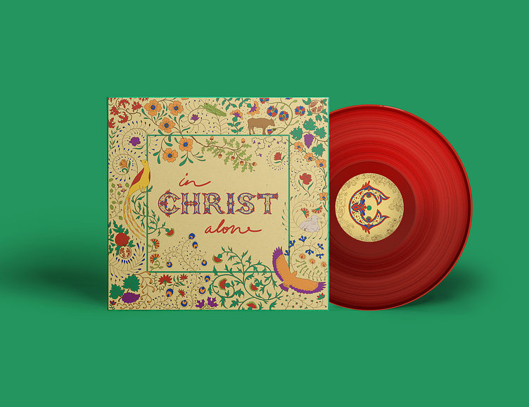
Album Cover Design
The premise of this project was to redesign the front and back of an existing album cover and create a commemorative album poster. I chose In Christ Alone by Keith and Kristyn Getty. My goal was to emphasize and glorify Christ as the central figure of this album through my visuals and typography. With inspiration from medieval illuminated manuscripts and art nouveau, I created an illustrated design with Biblical symbolism. To avoid portraying Christ outright, I instead used biblical symbols like the lamb, grapes, the locust, the ox and pomegranates.
My Milanote inspiration board. It includes ancient Jewish art, art nouveau, early Christian art and illuminated manuscripts among other things.
The front and back cover features meticulously drawn illustrations of flora and fauna, crafted to captivate the viewer within the detail. The color scheme draws inspiration from traditional illuminated manuscripts, and has an undertone of regality. Rich blue, red and purple evoke the idea of royalty and riches.
The script and Lombardic capitals have been carefully hand-drawn and designed.
The Lombardic capitals, in particular, I designed to command attention and establish a grounded presence at the center of the composition. They carry a sense of structural solidity, defined by thick vertical lines, and simultaneously exhibit a whimsical quality with curvature echoing the surrounding flora.


