Graphne - Production plan
Graphne project
Graphne is the name I created for a highly complex logical service that supports production planning. Data visualization is based on gantt diagram and dependencies graphs. It all began when my brilliant team devised an algorithm that optimizes production queues. Graphne is meant to be an addition to our MES system, Nexelem, but can also function as a standalone system connected to any MES system our clients may use.
The process
Current production plan issues, goals, and rationale.
Competitor analysis and benchmarking.
Defining user groups, their needs, and MVP functionalities.
Conceptual work on algorithm with Backend team through meetups and wireframes.
Design work with Nexelem library and new components.
Feasibility analysis with Frontend team and Product Manager.
Creation of flows and prototypes.
Usability and information architecture tests using Maze.
Simplification, redesign, and consultation.
Implementation of designs underway.
The greatest challenges
Responsive Gantt diagram
Reducing actions and functionalities to a minimum in order to deliver a clear, touchable GUI
To-do list logic
Timeline values
Dependecies graph visualisation
Functionalities
Planning production on gantt diagram
Node appearance customization
Queues order and names edition
Search, highlighting tool
Time scale selection
To-do list with it’s own tools
Node details with available actions
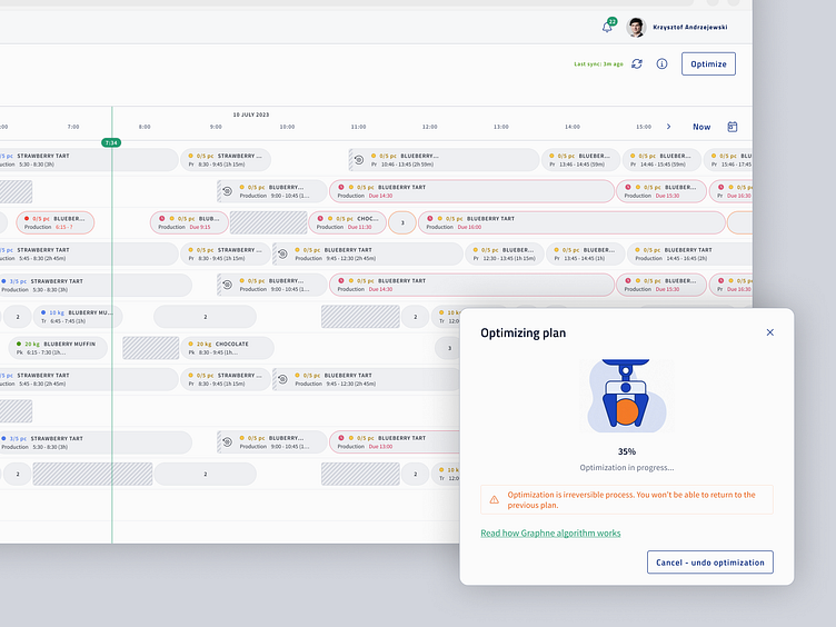
Optimizing plan tool
Dependencies between nodes (tasks and assets) view on graph
Viewing alternate plans (future improvement)
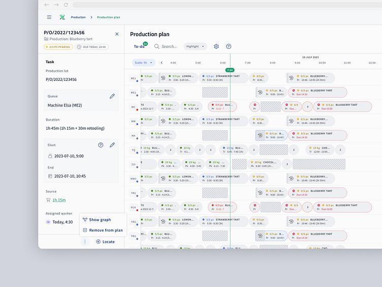
On gantt diagram nodes (tasks) are interactive. Whereas node can contain just a basic information, every node is supported by additional details presented in drawer. Actions that can be taken on task (like removing task from plan) are always located in drawer’s footer. One of the challenges here was to balance scope of information inside node so it’s visible but also informative. Another was the navigating between details, to-do list and dependency graph.
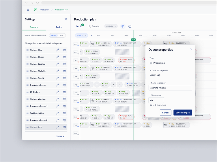
Above is an example of a modal window that allows the user to customize queues. Queues (like machines, transports between warehouse and machines) names can be displayed in short and longer version. Order and visibility of queues can be changes by user preferences.
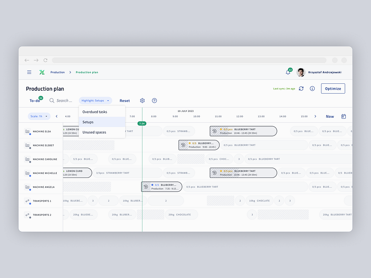
Gantt diagram is supported by tools that help to locate issues in production queues - e.g. what tasks are overdued, where are unnecessary time gaps or on which queues machine setups take too long/are to often.
Node component has many classes, highlight tool uses the class that emphasizes selected cases and partially obscure the others.
---
At VirtusLab Digital, we specialize in transforming user experiences through comprehensive UX research, intuitive UI/UX design, and reliable design systems supported by Front-end and Back-end development.
Need assistance? We’re here to help:
Discover more about VirtusLab and dive into our case studies at: