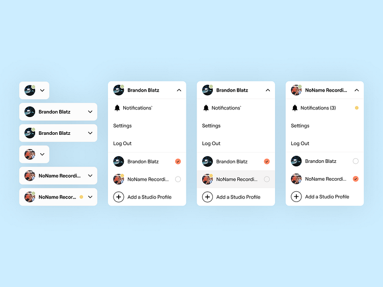
Profile Dropdown Menu
What you're seeing above is a dropdown menu for a multi-account user that I designed. I moved the Notifications section from the main navigation into this dropdown in order to better communicate (or signal) to the user that there is activity within their other account(s) that need their attention.
The solution here is similar to that of Instagram's current ux when switching between different accounts.
The components I created above show the possible states and permutations for an EngineEars.com user.
More by Emily Berg View profile
Like
