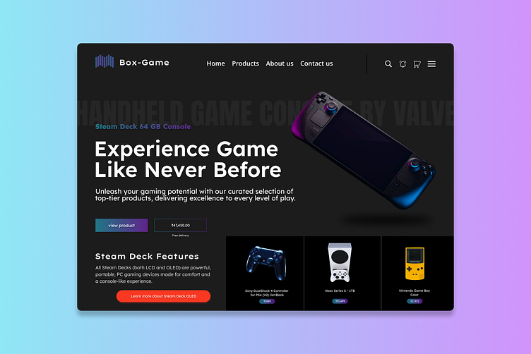
Index page of online electronic store.
Presenting a user-friendly design sparked by an Instagram post that caught my eye. Using images from Freepik and Unsplash, I wove together a design with a focus on simplicity. In this design, I opted for mostly black tones, steering clear of bold colors for a more subdued and sophisticated feel.
For a clean look, I chose Lexend fonts – straightforward and easy on the eyes. Icons and textures from Google add a touch of style without overwhelming the predominantly black palette.
The dark tones give it a sophisticated edge, creating an interface that's easy to navigate and easy on the eyes.
What are your thoughts?
Feel free to share your thoughts and comments. Don't forget to hit the "like" button to show your support. Wishing you all a fantastic day!
Please follow my Instagram for BTS and updates if you like my work.
