Mobile Banking App Redesign
Step 1. Defining UX/UI problems with existing Mobil Şöbə App
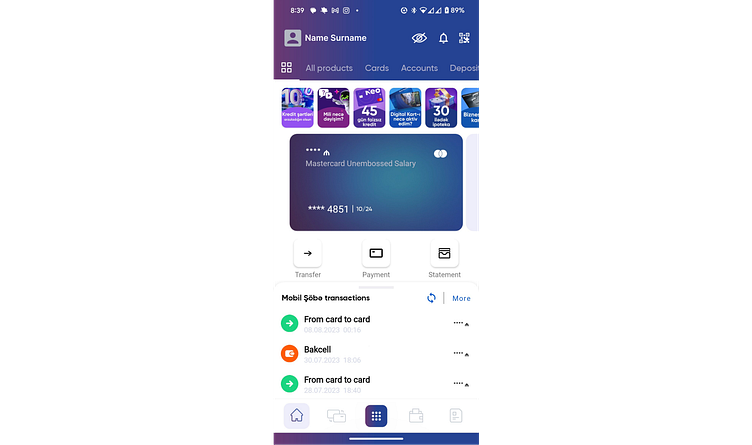
Based on my observations, Mobil Şöbə App has these issues:
• Cluttered Interface: The current solution is cluttered with various elements, making it potentially overwhelming for users.
• Misuse of Gradient Color Styling: Overusing gradient color causes the app to look outdated.
• Inconsistent Iconography: The icons are not consistent in style, which can lead to confusion. In addition, navigation bar icons are not labeled and it makes difficult for users to understand the intention of these icons
• Text Legibility Issues: Some text is small and might be difficult to read, especially the white text on a light background.
• Lack of Information Hierarchy: There’s no clear visual hierarchy; important information doesn’t stand out as it should.
Step 2. Ideate
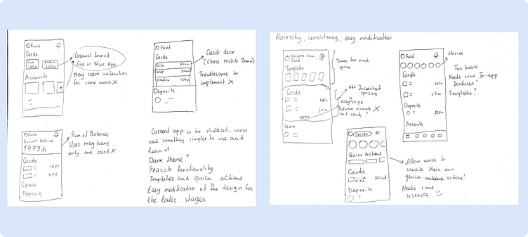
My 'Design Journey' began with paper wireframes, chosen for their comfort in creation compared to digital counterparts.
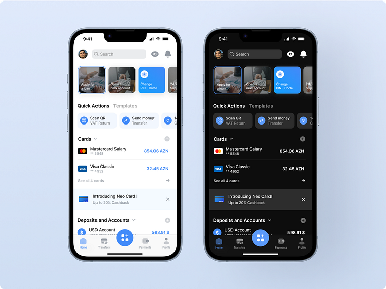
Hi-Fi Wireframes
Now let’s have a look at the Hi-Fi Wireframes of the redesigned version. Unfortunately, I wasn’t able to find Bank Respublika’s Brand Book, so I had to improvise. However, design I made is easy to modify, so changing fonts and color shouldn’t be much of a hassle.

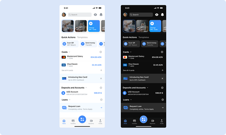
Home Page serves as the main page of the app. Here, users can effortlessly check their balances. The design is clean and user-friendly, featuring a simple and elegant color scheme of blue, white, and gray, and a consistent and intuitive iconography
Dark theme has several advantages in terms of accessibility, user preference, and battery saving. However, in the Azerbaijan private banking sector, only LeoBank and UBank offer a dark theme in their mobile apps. Mobil Şöbə should also be added to this list :)
Design Showcase
Thank you for reviewing my project!
I hope you liked it!
