The Pet Place
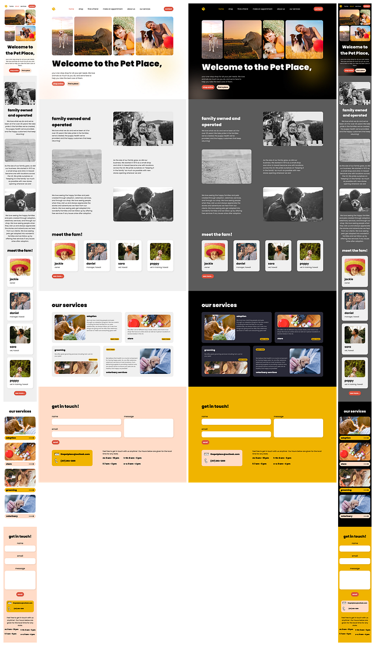
This is a design for a fictional business called the Pet Place that offers adoption, veterinary and grooming services as well as a shop. I created the main home page with a hero section, an about section, a services section, and a contact section. I had a lot of fun making this and hope to add the shop and other pages soon!
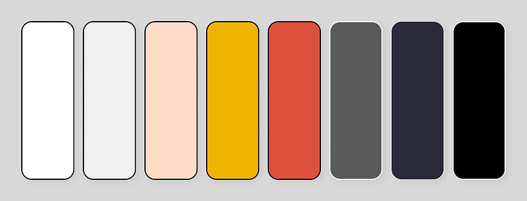
Color Scheme
I decided to use a warm color scheme with orange and yellow as the primary colors. I think this gives an inviting and playful feeling to the site, which seemed to fit the company. I also felt that the warm colors supported the heartfelt nature of the company.
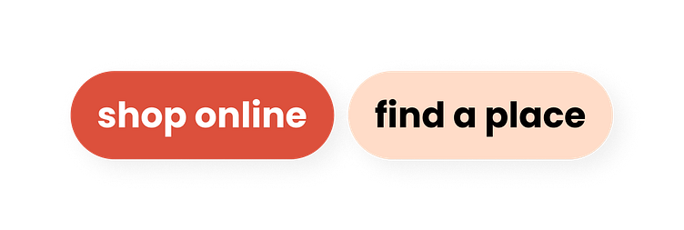
Button Design
I created a primary and secondary button for the design using the dark orange color and the sand color, respectively. I decided to use a completely rounded pill shape for both because I felt it would add to the friendliness and playful nature of the design and brand. The Pet Place is a family owned business that takes pride in finding great families for their pets and caring for them afterwards with toys and other supplies from the shop, grooming services, and veterinary services.
Link Design
I created what could be considered a tertiary button for links that I thought might be useful in the shop later. I also used it in the service cards shown below. I decided to bring the yellow color in for this and kept the same rounded design as the buttons. The main shape difference was that I reduced the padding a lot to make a lower profile button.

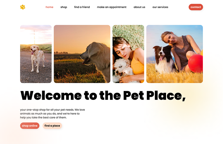
Hero Section Design
I decided to use several images in the hero section of happy pets and families. I think this helps give users an immediate idea of what the company is all about. I stacked these images horizontally above the section text. Additionally, I decided to alternate between a smaller and larger width to give more visual interest.
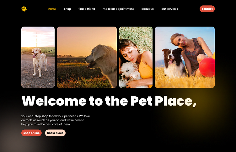
I also added some glowy circles to the design in the yellow and sand colors. I think these could rotate or move slightly in the implemented website.
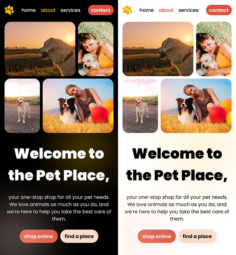
Mobile Design
In the mobile version, I decided to change the image row to a 2x2 grid using the same small and large image motif. I think this gave a lot of visual interest to the mobile version as well! Otherwise, I moved the text to be full width and centered (along with reducing the size slightly). I also modified the navigation by removing some of the links. My thought here is that the user can click on the logo to open a menu, but I might modify that later.
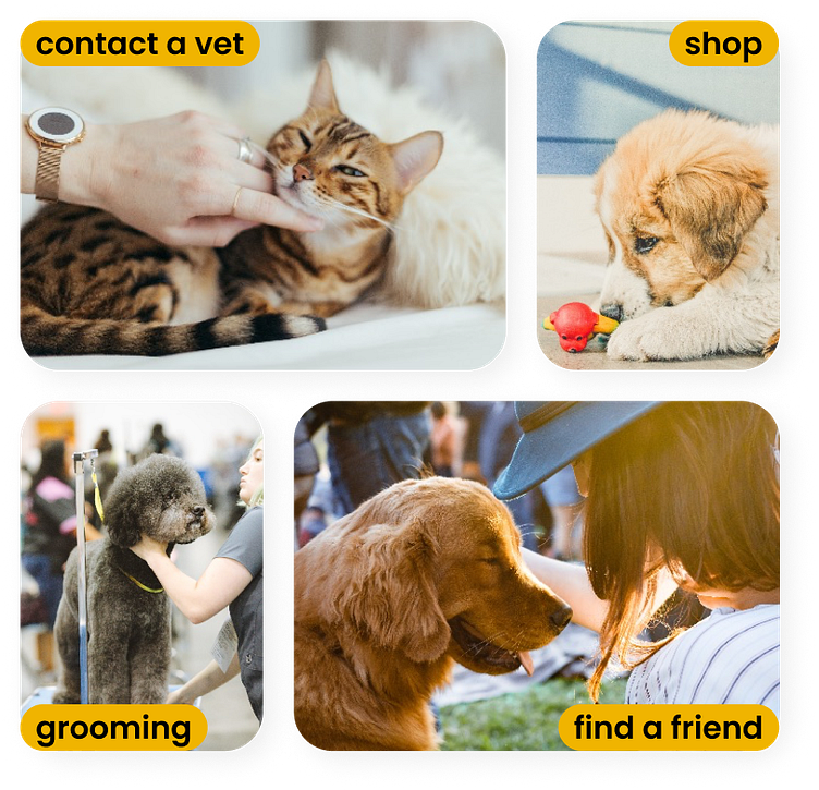
One other idea I had for the mobile version of the hero section was to add links to each of the services (replacing the ones present in the desktop nav bar). This could look something like the following grid with images representing each service and a link to go to the respective page. This could be a good way to quickly see what services are offered on the home page.
About Section Design
I created the following about section for the Pet Place. They are a family owned and operated business that spans multiple generations. I decided to highlight their story using black and white images that correspond to a part of the text.
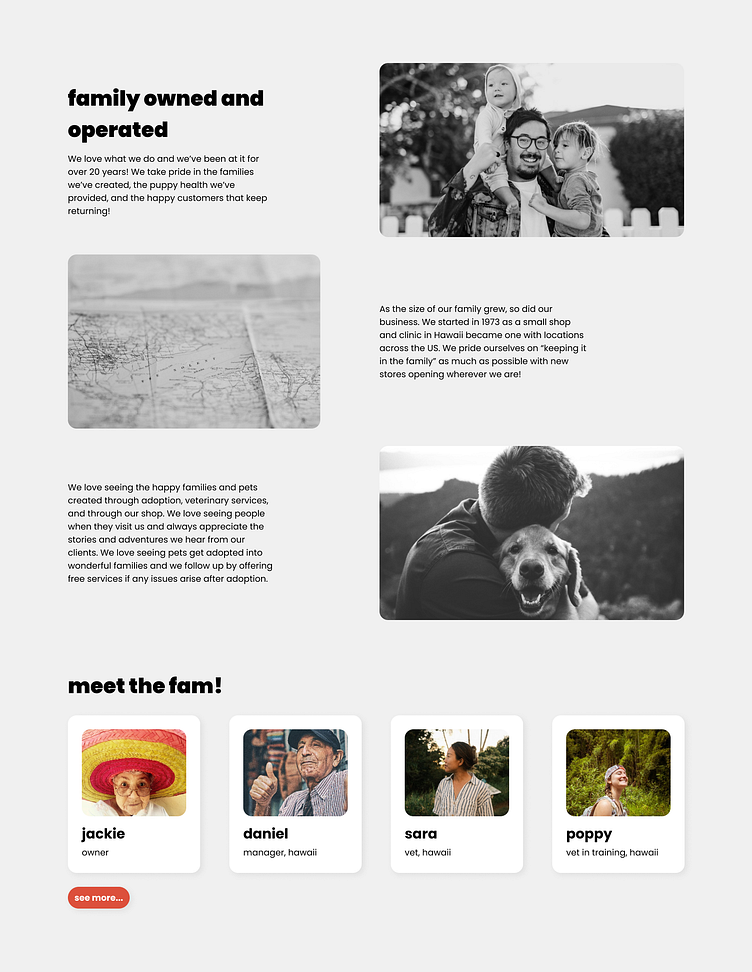
I also added a team, or meet the fam, section where I highlighted a few of the prominent members. The user can select see more to go to a page with all of the team members in a similar fashion. With the nature of the business, this is almost like a family tree!
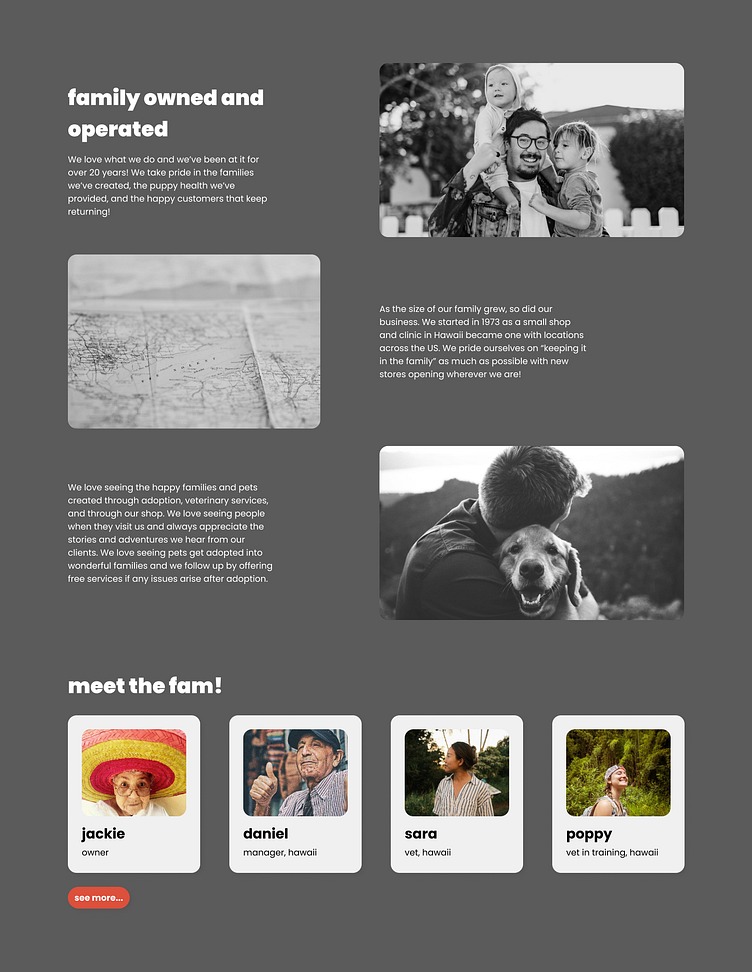
Dark Mode
The dark mode version of this section uses a darker grey in the background to keep the same style as the light grey from the original version. It might not be noticeable, but I also changed the card background to be the light grey from the previous design to reduce the starkness of the white cards.
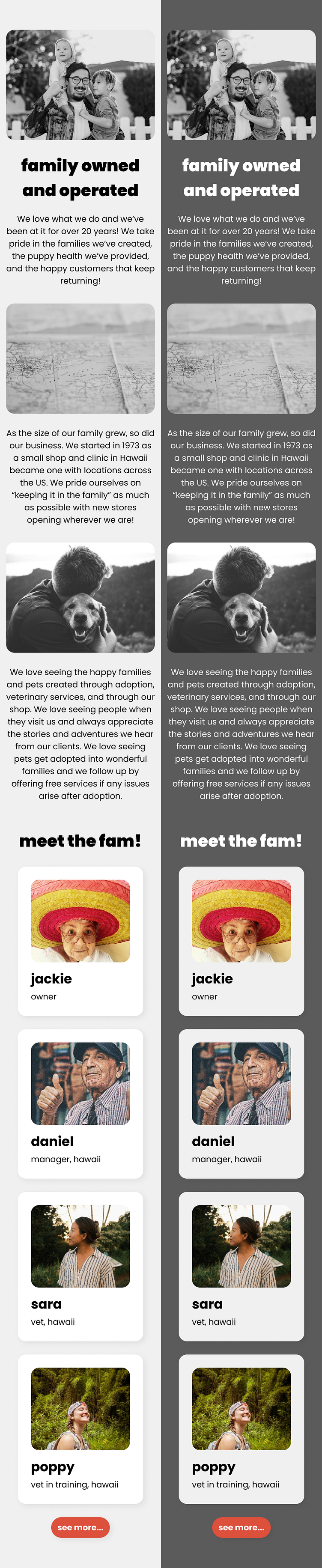
Mobile Design
In this case, the switch to a fully mobile version was fairly straightforward. I essentially just changed all of the rows to columns and centered everything up.
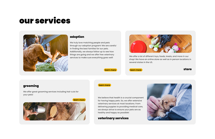
Services Section Design
The Pet Place offers several services including veterinary, grooming, and adoption, along with a shop. For the desktop version of the site, I decided to use a bento grid with two different box sizes (similar to the grid I used on the mobile hero section).
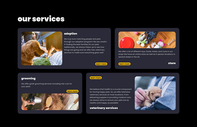
Each box in the bento grid included an image representing the service, a title, a description, and a link to learn more. For the larger boxes, I put the image and text next to each other horizontally. I also chose as a stylistic element to flip the image position as well as the text layout on the second larger block. I used a similar effect for the smaller boxes, except with the image and text being vertically situated in a column.
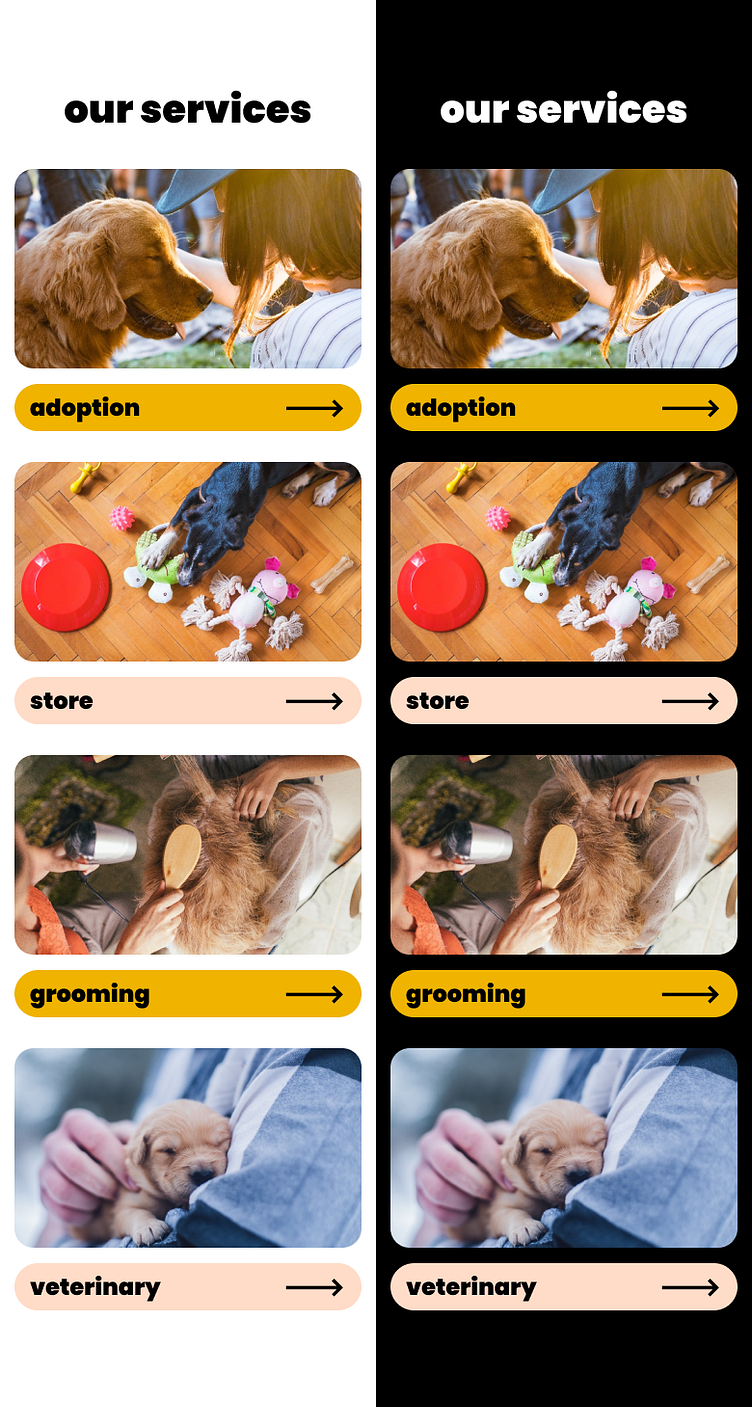
Mobile Version
I thought about reorganizing the grid to be a simple column with boxes of all the same width, but I really felt like the amount of text and content was a lot for a mobile site. I thought that the images and titles would be enough to portray what the company does. So, for the mobile version, I decided to create a button with the service name and an arrow indicating the user to click on it to go to that service. I think this section looks unique and still conveys the necessary information. Additionally, it could be used easily in conjunction with the idea I discussed above for the hero section.
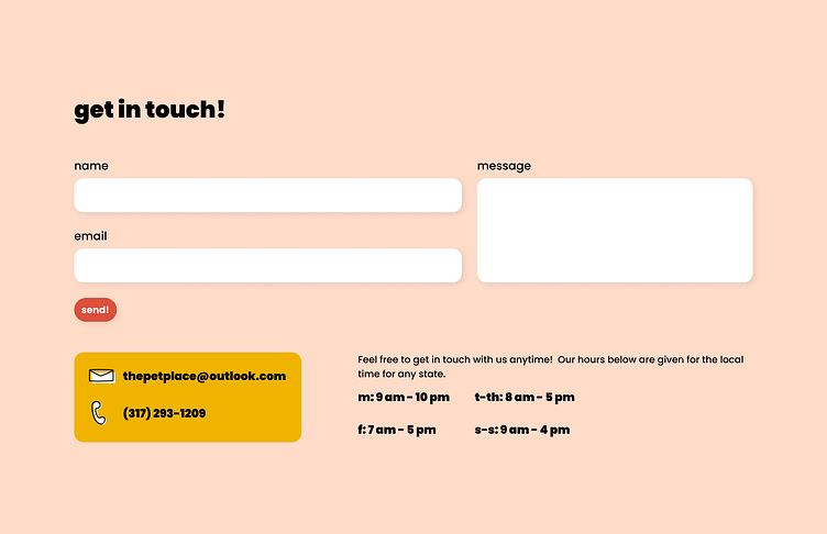
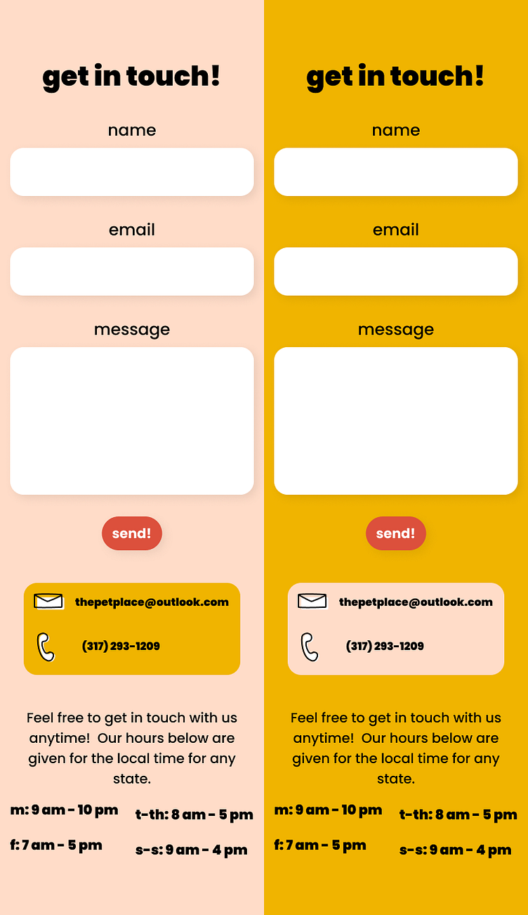
Contact Section Design
I wanted to end the site with an eye catching section. So, I used the yellow and sand accent colors in the contact section background. I created a simple contact form with the two inputs and the message box aligned in a grid. I also decided to put the companies main email and phone number in a yellow box to highlight it. I created the icons shown in that section as well. I think they allude to the brand's aesthetic in that they are quirky and inviting. Finally, I decided to add the store hours opposite the contact information.
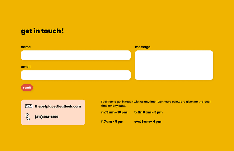
Dark Mode Design
For the dark mode version of this section, I simply switched the sand and yellow colors. I think this gives a similar effect while flowing better from the other dark mode sections.
Mobile Version
In this version, I created a single column for the form rather than the grid above. I also put the contact details and hours in a column rather than a row. I kept the highlighted box and the structure of the hours the same. Otherwise, I reduced the overall text size and centered everything.
The Final Design!
Here is my final design for the Pet Place! I hope you like it and I would appreciate any feedback!