[2023] 014: Full House
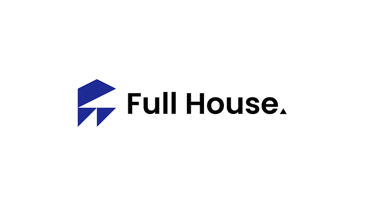
I recently had a class assignment in Geometry where we created a logo using strictly triangles. The result is above, and I created a company background for it (as requested by my teacher) which is below.
"Full House is a concept furniture and home store similar to Target. It strives to offer only the highest quality products at lower prices. The stores make each part of the home centralized and grouped effectively to the point where finding products is effortless."
Below is the standalone logo and its grid layout.
Below is a description of the logo construction that my teacher asked me to create.
"This logo uses two equilateral triangles, one scalene right triangle, two isosceles right triangles, and one isosceles obtuse triangle in its construction. It closely resembles the basic shape of a house with some abstract qualities and features."

