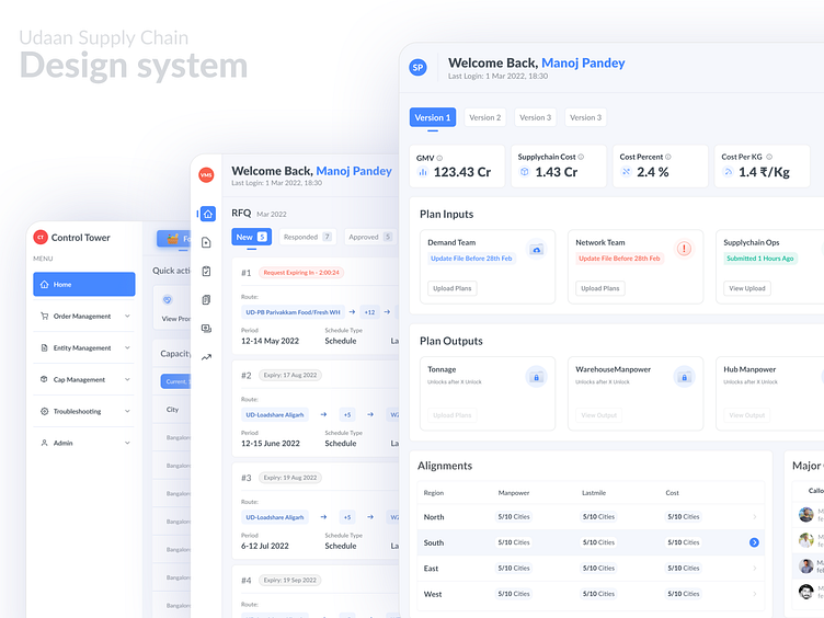
A Design System Story of Supply Chain 0.1
This was the beginning of a scalable design system from the learnings of designing 20+ web consoles, native apps and HHD workflows
This is how it started!
Have a look at the entire supply chain product stack, you may realize that similar actions have been handled differently by various owners with no consistency in design, This makes training difficult and often leads to human errors.
Colours
RGB is the default way computers talk about colours. But just because it’s easy for computers doesn’t mean it’s easy for humans. That’s where HSB comes in. Here I have used HSB colours.
Instead of going for a full 10 colours here, I tried to reduce the colours, so that other designers could easily follow the design style.
Custom Simple icons
The human eye likes to find simplicity and order in complex shapes because it prevents us from becoming overwhelmed with information. Research confirms that people are better able to visually process and remember simple figures than complex figures.
Custom illustrations, empty states
& Loading Animation
I was the only designer working on this Project, there was a limitation in spending time on creating custom illustrations, these are some of the unique cases where we needed particular patterns to make users aware of this design system.
Fonts
We used Lato fonts for this Design system, Lato has good
readability on small fonts.
Buttons
We had different types of buttons like Primary, Secondary and Tertiary buttons with different variations. elaborated Do/Don't for other designers to follow the design easily.
Form Fields
I have created all the possible variations of the form fields which can be a good use case for the SP design System!


