Card Component ideation
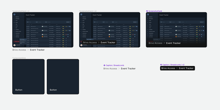
created 3 different versions of a card component (screenshot + text overlay or beneath). Just laid out the styles here.
Pretty basic approach. Ended up using the third card: liked the dark gradient along the bottom to emphasize the text. (Just remember to set Figma's Constraints to "left and right" to make the absolute positioned text layer stay responsive)