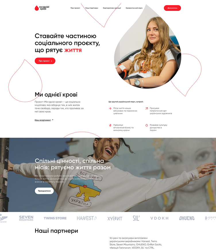
We Are The Same Blood- Landing Page
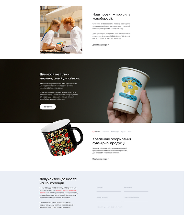
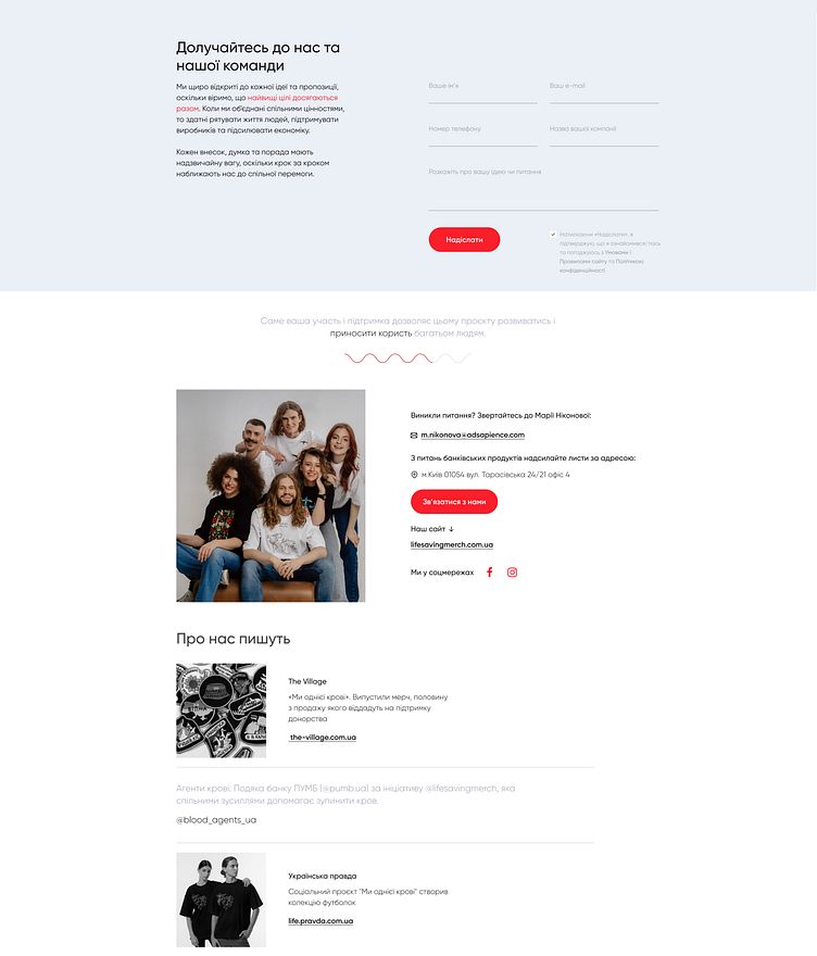
Hi there! This is a minimalist landing page, targeting corporate clients for participation in blood donation drives and branded merchandise. The firm's signature colors of dark gray and red symbolize not only a deep commitment to the community but also the strength and passion driving the initiative.
Responsive Interface: Optimal display across various devices.
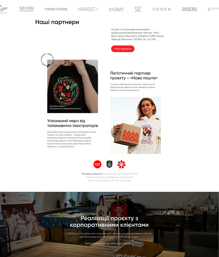
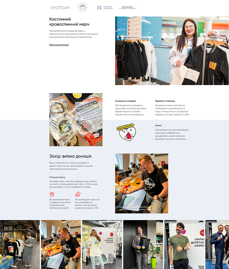
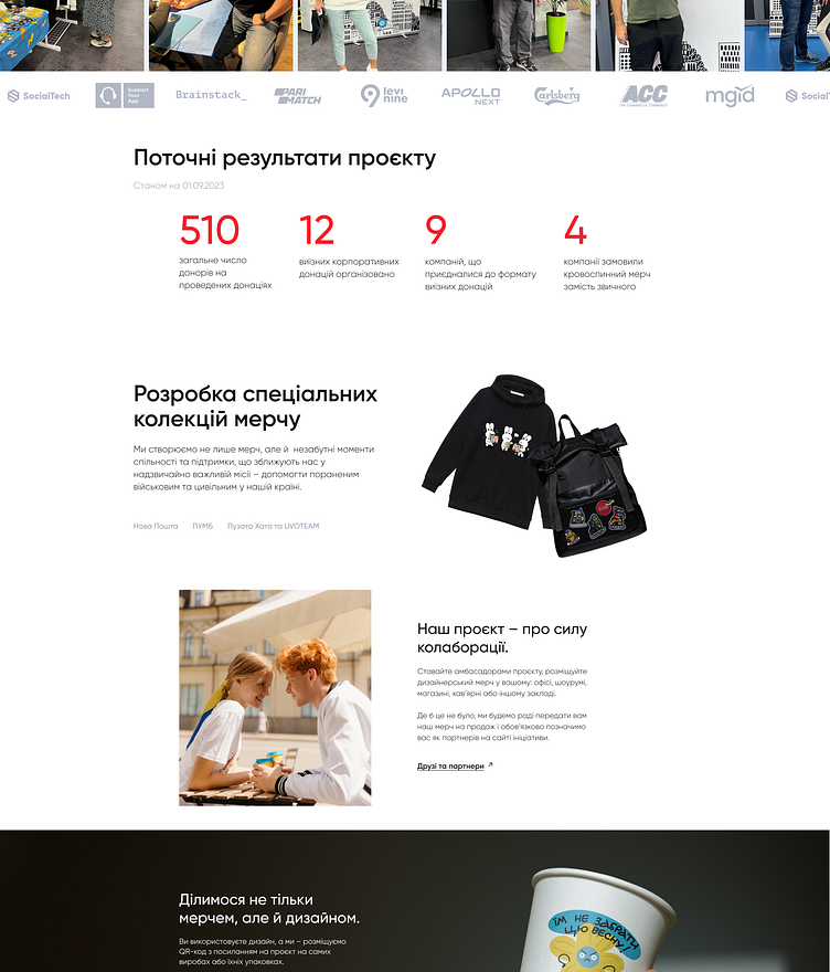
Rhythmic Composition: Meticulously designed with a grid system, the landing page exudes a rhythmic and visually appealing composition, enhancing user engagement.
Engagement-Driven Design: The layout fosters a sense of involvement and urgency, encouraging businesses to participate in vital life-saving activities.
Responsive Interface: Optimal display across various devices.
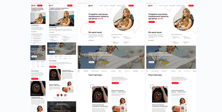
This landing page serves as a sophisticated gateway, connecting businesses with opportunities to contribute to a significant cause in a visually harmonious way.
❤️ if you love it and share your thoughts on this one!
