Credit Card Mobile App
Hey everyone 👋🏻
"Credit Card App - Seamlessly Balancing Functionality and Design Elegance"
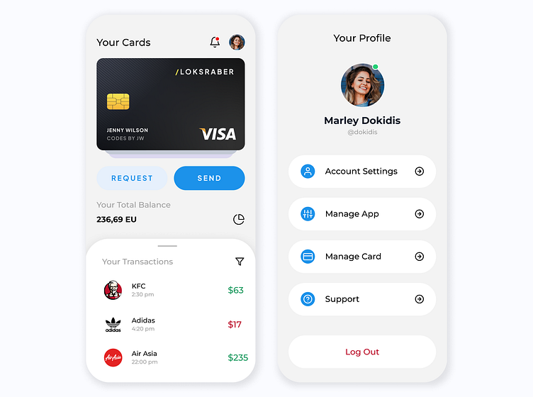
I developed a user-friendly credit card app that not only provides essential financial information but also offers a visually pleasing experience. The app includes two screens: one for card balance and another for the account profile, each designed for both light and dark modes.
Hit Like if you like it 😁👍🏻
Design Considerations:
Card Balance Screen:
Light Mode: Soft color palette, emphasizing clarity and ease of reading.
Dark Mode: Subdued tones with contrasting elements for optimal visibility.
Key Features:
Prominent display of current card balance.
Transaction history with clear categorization.
Quick access to payment options.
Account Profile Screen:
Light Mode: Clean and professional layout for easy navigation.
Dark Mode: Elegant, with subtle accent colors for a sophisticated appearance.
Key Features:
User-friendly account details and personal information.
Security settings and options for easy customization.
Clear calls-to-action for updating account information.
Outcome:
The Credit Card App stands as a testament to the successful integration of functionality and aesthetics. Users benefit from a seamless experience whether they prefer the clarity of light mode or the elegance of dark mode. Positive user feedback and increased engagement underscore the app's success in providing a comprehensive and visually pleasing solution for managing credit card information on the go.


