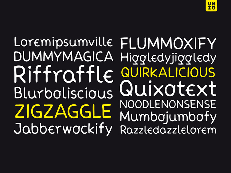
Neue Comic
Meet "Neue Comic," a rounded typeface making a bold entrance into the design scene, aiming to redefine the delicate balance between playfulness and practicality in typography. Crafted with the recognition that rounded aesthetics enhance information retention and legibility, Neue Comic delivers a distinct, rhythmic design that breaks through traditional design boundaries.
Reflecting on the divisive legacy of Comic Sans, we pondered: Is it really deserving of all the hate? Comic Sans entered the typography scene in 1994 with the noble goal of injecting fun into casual contexts. However, it fell victim to misuse and eventually succumbed to an undeserved sense of imposter syndrome. This prompted us to create a typeface that transcends these limitations.
Inspired by the non-connecting script of comic book lettering, Neue Comic seeks to recapture the charm of the '90s while acknowledging the genuine intention behind Comic Sans—offering accessibility and friendliness. Avoiding the pitfalls of overuse, Neue Comic presents itself with seven weights and corresponding obliques, showcasing the flexibility of a variable version.
In a world where fonts often lack humor, Neue Comic invites designers to explore its versatility. Armed with robust typographic features to support its visual appeal, Neue Comic challenges the notion that fun cannot coexist with sophistication. It revives the spirit of the '90s icon while paving a fresh path for the future of rounded typography. Neue Comic is not just a typeface; it's a celebration of the joy in design, proving that fun can indeed be cool.
Freebie: https://tinyurl.com/neuecomicfb
Premium: https://tinyurl.com/neuecomic
Thank for viewing, Unio.
