Real Estate Marketplace Website Concept
💌 Have a real estate website idea? We'll be happy to help!
hello@ronasit.com | Telegram | WhatsApp | Website
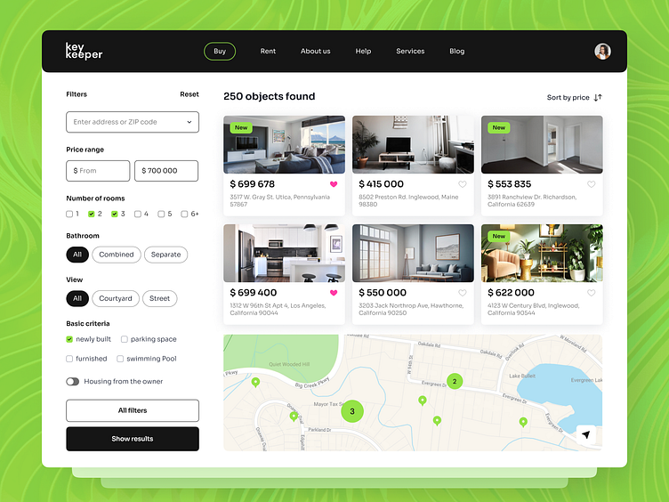
Hello everyone! We’d love to present our design concept for a housing purchase service application. Let’s take a closer look at its features.
The first screen is equipped with filters, a list of apartments, and a map that visually presents the filtered apartment options. The second screen highlights the service's main screen, slogan, and key functionalities.
The key feature of this design lies in its extensive filter system, crafted to enable users to find their ideal home swiftly. The combination of color and functionality creates an engaging and serious interface, matching the significance of buying a property.
We've selected a dominant black color for its elegance and the gravity it lends to real estate transactions. In contrast, the vibrant green accents symbolize joy, comfort, and life, bringing an enjoyable and lively yet earnest contrast to the interface.


