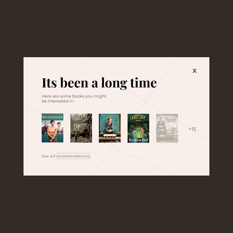
Daily UI : 016 Pop-Up / Overlay
I remember about this design that it was one of the first times that it used a serif font and that I really liked the result. Although it had little content, the harmony of the composition highlights the saying "less is more."
More by Estheban CG View profile
Like
